
The graphic design trends for logos in 2015 will be **drum roll**
 The typography based logo
The typography based logo one that is entirely written. These logos exist already but it is predicted that they will flourish next year.

The incomplete logo
This one will make you think, "Is that the whole thing?" Yes, yes it is. It is as if the company made a logo, put it on a cutting board, then chopped part of it off.
Hand-drawn logos


Letter stack logos
Instead of say the company name in one, horizontal line, the logos will separate the name into sections and then stack it all up. This one looks nice but can create difficulties saying the brand name if you have never seen it before.

Recurring patterns in the design
This one is actually pretty cool. The logo will feature a design and then have it repeat; often times, the repetition of the design flows together so no part of the
repetition stands alone. As a Chicago graphic designer, this one is one of my favorites.
Transparent overlays
Typically done with shapes, each shape will look transparent and be influenced by the other sections of the logo. Example, having a red box and a blue box with the overlay in the middle being purple so it looks like each box is transparent. The same thing with circles, hexagons, etc.

Bright colors
Expect to see yellows, oranges, reds, and other bright colors be the norm.
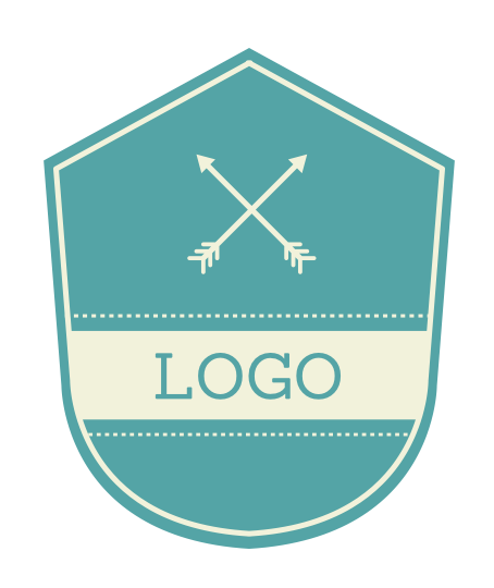
Crests
They look preppy and edgy.

Geometric shapes
Using triangles, squares, and other geometric shapes will be a hit because we all like shapes, right?

Double meaning symbols
These are actually really cool; it is when the logo will incorporate something from the company into the logo and have it double as a letter, object, etc. Example: a sushi place using three chopsticks as the H in "SUSHI". Get it? This one can be done in a really sleek way if you find the right Chicago graphic design firm.
The negative space logo
 Negative space is white space. Expect to see logos using white as the main color.