Tuesday, June 9, 2015

Why Has the Wheaties Box Stayed so Iconic?

With so many things coming and going in the world, especially with branding and package design, it is hard for brands to keep old designs relevant and intriguing.

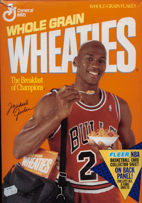
General Mills has been able to do that for one of their flagship brands, Wheaties. The box's design has stayed the same over the years, with some very minor modifications (such as the addition of the shadow to "Wheaties" and changing the shade of the shadow, etc.)

One thing that is effective, and popular, in package design is using bright colors. Next time you are at the store, take a look at the packaging on the shelves, your eyes will gravitate towards the packaging that use bright colors, such as orange. Bright colors get noticed twice as much as dark or mute colors.

Another reason why the Wheaties box is still iconic to this day is what we can expect from it, this is two-fold.

  • The first part is that we can expect a quality cereal that is valued by families, especially moms, and we will like the taste of. Part of great package design is having something worthy of being in that package. People will be intrigued by a product when they see a cool design but if the product's contents don't live up to the hype of the packaging, consumers will stop caring about the packaging and the product altogether. 
  • The second part is that we can expect an incredible and noteworthy athlete to be on the cover. This represents greatness, along with their tagline, "The Breakfast of Champions". Consumers now care about the quality of the product inside but also what the product represents. To change the package design would impact the love and care consumers have towards the product & its meaning on their lives. It sounds stupid but it's true; look up how much people cared about the design of the Tropicana cartons
Great package design begins with great graphic design. The colors have to match, the fonts have to look good and be readable, and there has to be good usage of whitespace and images. Wheaties has accomplished that and it hasn't done anything to mess with that. 

Tuesday, June 2, 2015

New IHOP Logo for the Digital Age

IHOP has shown that it is always willing to greet the next challenge on the web. They are a 60 year old company that excels at social media marketing, blogs, and now emoticons. In fact, they even rebranded with a new logo design to keep up with the digital age.

Many logo design analysts have mentioned that the O and P of "IHOP" make a pair of eyes and nose. IHOP is now embracing that find that even added a red semi-circle to complete the face. This face Mimicks emojis found on the web.

Another great realization about this new logo is that it captures the spirit of IHOP and its customers; people go in hungry, eat delicious food, then leave happy. It's part of their tagline! Happy memories are shared by people at IHOPs and some are even created there.

Just because your business is old, or "established", doesn't mean it can't or shouldn't evolve. Businesses have to keep up with consumers or they will be left behind. If your business is in need of some updating, email or call Integraphix, a graphic design studio and creative marketing agency in Chicago.

Tuesday, May 19, 2015

Mad Men May Be Gone But Its Wonderful Graphics Live Forever

Every TV show has a certain style to it, especially its art and graphics. They are what set the show apart aside from the characters and the show in its entirety.

When a TV show has great, unique graphics, images, and artistic style, you recognize it all right away. Let's look at Mad Men's graphics and style for a minute. The red and white font colors (though "men" sometimes appears in black), and the sans serif typeface, are not unique to Mad Men. Other shows have used that typeface and certainly those two colors. However, when put all together, it becomes something special to Mad Men, especially when you look at how the show's name is split between the two colors (notice the emphasis on the "Mad" since it's in red?)

What is really special about the artistic style of the graphic design for Mad Men is the B&W figures, such as what appears to be Don Draper in the main image of the show. We also see a faceless, ambiguous, B&W man falling during the opening title sequence, seen here.

These faceless, 2-dimensional characters really don't stretch or further the artistic world but they are special, unique, and downright cool. No other show utilizes this style of art and it is easily identifiable by anyone who has even heard of Mad Men. These figures bring something incredibly unique to the table as well, we are able to become those figures since they have no faces. The graphic design team who created these figures made them faceless for a reason (and not because they couldn't draw faces); they wanted viewers to be able to be in the place of those "people".

This is what great, unique, and creative graphic design can do for a company, TV show, movie, or anything else, really.

A great professional graphic designer can identify some nugget of uniqueness in a project and build that to be a "competitive advantage" for a design; that objective was met and exceeded by the team who made this art. If you want that for your business, then call or email Integraphix, a Chicago graphic design studio.


Tuesday, April 28, 2015

Coca-Cola Alters Classic Ribbon to Embrace Genuine Friendship

A classic, nay, iconic sign of true friendship is the fist bump. Coca-Cola has decided to embrace that sign of affection and connection in its new campaign in Latin America.

The goal of the campaign is to engage teens in a conversation about being true friends, especially in difficult moments. In the teenage years, it is a vulnerable time of social pressure, especially in 2015 with cyberbullying. Coca-Cola has made short web films showing teens stepping up for their friends in difficult times.

The graphic design will be featured on packaging, merchandise (t-shirts & phone cases), and other media.

As a Chicago graphic design studio, we love the simplicity of the design that still builds an incredible message. Call or email Integraphix about how your business can create great graphics to build brand awareness or awareness for a cause.

Tuesday, April 21, 2015

A Quick and Easy Way to Create Graphics

If you are into blogging, cool social media posts, or just like the idea of creating images & graphics for things (maybe invitations, posters, album covers, etc.) but you are not that great with Adobe Photoshop, InDesign, or Illustrator, then we have a savior for you.

Canva

If you are unfamiliar with Canva, for whatever reason, we we will give you a quick and easy tutorial of how to use it.

1. Sign up form account.


2. Choose a design template that you'd like to use. Canva conveniently labels them so you know what size works best for your project. There are more options than in this picture but we can only take screen shots that are so big, you know?


3. Choose your project. For this example, we will choose the "social media" template. There are templates for specific social media platforms, emails, marketing materials such as business cards, posters, flyers, menus, etc. You can also choose templates for documents and presentations, blogging & ebooks, events, advertising tools for both print and web. Yeah, you have a lot of options.


4. Get to creating. From here, you can choose your various options.


a. Layouts that are pre-designed. Some of the layouts are free to use and some cost $1. If you choose a layout, you can manipulate it how you want. You can change font, images, colors, etc.


b. Text. There are several text layouts that you can choose from, again, some are free and some cost $1. If you don't see that you like, you can add in your text that is structure-free. As a Chicago graphic design studio, even we approve of the text options they offer (although, they do offer Lobster and a few other iffy fonts…).


c. Backgrounds. Want a cool background? They have plenty of options, free and $1. Again, you can change the color of the background. Top left corner, you can see the color options (the + is so you can create your own color).


d. Uploads. You can upload your own photos to use in your creations, too! You can connect to Facebook and Google Drive to attach photos as well.


Are you excited to use Canva? We sure hope so! If you have any questions, don't hesitate to contact Integraphix, a Chicago graphic design agency with over 25 years experience.

Tuesday, April 14, 2015

Is Hillary Clinton's Logo Really That Bad?

This is the new logo for Hillary Clinton's 2016 Presidential run. Right away, the logo design came under fire from critics about its lack of… everything.

Some people have compared her logo to a speed bump (if you flip the logo counter-clockwise 90 degrees). Some people have said the arrow makes it look like the "I'm with stupid" shirts. One of the more clever comparisons is that the logo looks like it should be on a 90s windbreaker or sailor shirt. One of the most common comments about the logo is just how much it reminds people of the FedEx logo (because of the arrow pointing right).

The graphic designers at our Chicago graphic design studio have some input.

 Every professional logo designer knows that a logo has to look good in every circumstance. One very common circumstance to consider is what the logo will look like in B&W. After all, not everything is printed in color.

This is what Hillary's new logo looks like in B&W. You can barely tell that there's an arrow in the logo. Without the arrow, the whole messaging behind the logo is lost.

It looks like an "H" with something being pushed out of it. The colors are too similar in value for being directly adjacent with no separation.


Another thing that is wrong with the logo is that the arrow makes the logo too heavy on the right side. The "H" looks like it will take a tumble to the right, as seen in the image.

The large arrow makes the logo feel unbalanced and too heavy. A good graphic design company will tell you that the best logos have balance.

So what do you think of Hillary's new logo? (No political bias, please). Do you think it is good or could it use some tweaking? Perhaps you can recommend your favorite political logo?

Let us know! Reply in the comments or email Integraphix with your thoughts about Hillary Clinton's 2016 campaign logo. 

Tuesday, March 31, 2015

10 Common Mistakes Graphic Designers Make

It can be easy to make a mistake as a graphic designer, especially when you are not a very seasoned graphic designer. As a Chicago marketing company with a team of experienced graphic designers, our team put together a list of 10 common mistakes that are made by designers to help you grow as a designer with excellence!

  1. Having Multiple Typefaces. Never use more than three fonts per layout; in fact, our team doesn't advocate using more than one or two, just to be safe. If you use a logo in a layout, you can have continuity with the logo by using the typeface from the logo with other copy. 
  2. Abusing Emphasis. Use font tricks carefully to create emphasis, don't use too many or it can be counter-productive. 
  3. Double Spacing. If you have a habit of hitting the space bar twice after a period, you'd better nix that habit. It can be distracting and is often considered taboo by typesetters. 
  4. Using All Caps. Using all caps in a design can look amateurish and be distracting. 
  5. Underlining text. Underlining text is only okay when showing there is a link. Underlining text was originally created as a way to show there was special text when bolding wasn't around (with typewriters). 
  6.  Not Knowing where commas and periods go with quotes. The comma and the period will  always go inside the quotation marks when using a quote. Other punctuation marks, such as question marks and exclamation points, will go outside the quotation marks unless they are part of the quote.
  7. Not Knowing Dashes. There are three types of dashes. You can use the hyphen or minus sign, which is used for breaking apart words and to prevent weird spacing. There's the en dash ' ' ' which is called that because it is often wider than an "n" and should be used to replace "to", such as 9'12 p.m.. Finally, there's the em dash, which is the longer option of the dashes here and is used to split up sentences, much like a semicolon. 
  8. Ladders. These are multiple hyphenation that appear on consecutive lines. Do not put more than two consecutive hyphens or it will steal the spotlight in your copy. 
  9. Rivers. If you really want to justify your type, be on the look out for big spaces and gaps, which appear vertically in your type, these are called "rivers of white space". You generally see these in newspapers. 
  10. Special characters. We are talking about things like the copyright, registered trademark, ™, and ellipses. Use these when using a brand's name or something that has one of these connected with it (except for the ellipses). Use an ellipses when omitting part of a quote. 
Do you want to know more trips that can help your career as a graphic designer? Then email Integraphix, a Chicago graphic design company


Wednesday, March 18, 2015

Do Images Matter with Digital Marketing?

Almost 85 percent of Americans describe themselves as visual learners. This is a significant amount of people who need visuals to truly understand a concept. As a Chicago graphic design agency with a social media marketing department, we realize the collaboration between graphic design and social media is more important than ever. Think about the social media posts (especially Facebook & Twitter) that grab your attention, they are likely ones that have images and possibly a link as well.

Images attract our eyes and thus, our attention. When you have a post on Facebook that has an image, it is 7x more likely to get shared compared to a post that is pure text. Twitter encourages people to post with an image or graphic as well, such as an infographic, if the time calls for it.

Psychological tests have confirmed that when we are shown an image and text, we spend most of our time looking at the image, which is wonderful news for a Chicago graphic design studio; however, that does not make the text useless, text with an image gets more looks than text with no image.

The incredible growth of visual-based social media platforms such as Pinterest, Instagram, and Snapchat is a true testament to the power of visuals in social media. Know what's one of the most popular and impacting features of Facebook? The images option. This is why Facebook and Twitter have made such great efforts to encompass images (and video).

Images work. Images sell. They grab attentions, which are getting shorter and desire more appealing objects. Sometimes an image is able to have the call-to-action that words just can't convey. Images stick in our memories longer, this is why having a great logo design is so important, too. The visuals improve our muscle memory, aiding content associated with that image to be more memorable as well.

However, using or creating images for social media posts have to make sense and be appropriate for the platform it is posted on; a blog post about baseball and showing a photo about your dog will not work. Another thing to remember is that you need to have appropriately sized images that are also cropped and not distorted.

It is time to make your social media posts, blogs, and website design stand out and use great images. Email Integraphix - a Chicago graphic design agency - about your graphic design needs and tips about images.

Wednesday, March 11, 2015

Will the Trend of Misspelled and "ly" Brand Names End? Probably Not.

Startup businesses have a lot of things on their "to-do" lists. They have to get their structures in order, their processes in place, and just about everything else is needed, too. Of course, they need great logo design and branding, which includes the challenge of creating a unique business name. Businesses have to create names that are both memorable and meaningful.

Regardless of an industry, businesses have the desire to come across as innovative, creative, and forward. This has launched the trend of creating business names that end in "ly" and "fy", such as Bitly and Spotify. Aside from that trend, companies are often omitting the vowels from their names; this allows companies to take average words and create a unique business name, such as Tumblr. This can also create a fun and unique logo design and other designs for their graphic design work.

There are over 100k domains registered every day. That is a lot and forces businesses to think outside of the box when it comes to a domain URL they can secure, which affects the business name. Could this by a reason for all the funky business names? Possibly. Look at the music sharing app, nwplying, which is "now playing" sans most vowels and spacing. The CEO wanted to describe the business's purpose in a simple form but "now playing" was too generic & would not make a unique name or hashtag; they removed the vowels and boom, done. Also, it was a shorter, very easily attainable URL to buy.

While the ease of securing a domain can impact a spelling of a business name, it also helps brands stand out in a business world where startups are common, especially when you look at the SXSW. It helps businesses sound edgy; consider the business name, "Unbxd". The founder of the business describes the name as a way to describe the business's mentality that it isn't confined by any boundaries; it describes the business's vision instead of just its product.

Of course, a unique, perhaps strange sounding name, can arise from what is meaningful to a business; the name is not always limited by available domains, a fun trend, or appearing edgy. Tech startup, Tiinkk, an iPhone app, created the name after the founder had a conversation with an Irish friend who said, "I tink you should call it…" and there you go!

Creating a business name can be difficult and creating a logo for it can be even harder. Does your business need assistance creating a name or logo? Then email Integraphix, a Chicago graphic design agency.

Wednesday, March 4, 2015

5 Things Your Logo Needs to Be Successful

Before a business can even think about a business cards or finding an office to have office space, a business needs a logo design. The logo will compliment the business name, feature your business's color scheme, and have important design elements. It is the base upon building stationary, packaging, any advertising, or signage.

A logo needs to reflect the image that the company wants to convey. As our Chicago graphic design agency has stated before, your logo will be how people form an impression about your business before engaging with it directly and it will be how they remember your business.

The best logos in the world have these five design concepts in place. 

  1. They are simple. The best way to think about simplicity is how many components there are to the logo. Look at the logo for the Chicago Cubs or Apple. Apple's logo is a simple apple shape (with the bite out of it) and is shown in black or grayscale; the Cubs logo is a simple, red "C". The simplicity of these logos makes them easy to look at. The easier information is to process, the likelier we are to remember and like that information. 
  2. They are brand consistent. Your logo constantly speaks about your brand and vice versa. If there is a mismatch here, it will stand out. Your logo needs to fit with your company's overall message. Look back at the Apple logo, it speaks about the brand being innovative, futuristic, and sleek. All of these things are seen when you look at Apple's products and business operations. They pride themselves on making great tech that is easy to use, so their logo is easy to understand. Any great professional graphic designer will mention Apple's logo when they talk about brand consistent logos. 
  3. They are memorable. Remember when we said that people will remember your brand from your logo? Well, that is hard to do if your logo is far too complicated and/or makes no sense. Logotype or word mark, a stylized version of your company's name (think Coca-Cola) is much easier to remember than an abstract logo
  4. They are remarkable. This is your logo's ability to cut through the noise. This is more suitable for startups than established brands. 
  5. They are market tested. While our minds and our gut can produce some good logos, no good logo hits the market without being tested, first. Getting feedback about a logo is necessary and will help you find any possible flaws. The logos that we see and think, "Who approved that?" Chances are, those logos were not put through any market tests. If your business designs its logo on its own, then this is a very crucial step, even if you think you have a good eye for design and colors. No matter what, even if a logo is designed by a professional logo designer, it is still market tested. 
Does your business need a logo? Then email Integraphix - a Chicago graphic design company with over two decades of logo design experience. 

Wednesday, February 25, 2015

Script Logo Designs: Yay or Nay?

There are several logo design trends that are having their moment in the spotlight here in 2015, one of those designs is script logo design.

It is essentially a kind of logotype where a personalized, custom script is used to establish and portray the company's image. Some of the ways companies use the script can be very appealing and stylish, while other attempts can fall flat.

Let our Chicago graphic design company know what you think! Email Integraphix - a Chicago logo design agency - and give us your thoughts. Need a logo? Then consult with one of our professional logo designers

Wednesday, February 18, 2015

Integraphix Work: Integraphix Designs Weldbend/Gene Simmons Ads & Billboard

Weldbend knew that they had a big job to get done for their annual event in Las Vegas and booked Gene Simmons for the show. They had to grab a qualified Chicago graphic design company...

Weldbend came to Integraphix.

The job was to design and develop the advertising and print marketing for Weldbend's annual IPD breakfast that is held at the Bellagio in Las Vegas. Each year, they have a different guest such as Mike Ditka, George Foreman, Regis Philbin, Don Rickles, Bill O'Reilly, and as stated, Gene.

The marketing collateral had to really pack a punch. Our Chicago marketing company created the marketing message, headlines, and all of the copy for the advertising for several mediums such as the billboard, airport sign, and hotel lobby/conference room.


Weldbend and Gene loved the ads! 

Does your business need advertising for an event? Big or small? Then email Integraphix and see what we can do for you!   

Wednesday, February 11, 2015

Need a Boost for Your Social Media? Use Images. Here's Why

Digital marketing, especially social media marketing, has done a lot of changing over the years. One of the changes that has come to be in the last few years is the image & video centric posts for brands; without images or videos, brands are seeing the success of posts fall flat. This is a great time to think about finding great images or even creating images. Whether you are a Chicago graphic designer or just a social media enthusiast, creating or finding images does not have to be difficult.

Why do we need images with social media posts? Simply put: people like visuals. According to several trend reports, 65-85 percent of Americans claim to be visual learners; even away from learning, people like to look at pictures, watch videos, see colors, etc. If you remember this with your social media campaigns, then you will see a greater level of engagement with your posts compared to your posts that do not have visuals.

People have limited attention spans and little time to read through a lot of text. A good image can break the reader's skimming of the text, which is what you want, nay, need to happen so your posts on social media get read (hopefully before anyone else's). It is not very appealing to see a whole block of text, either. To counter this and break through the noise, images and videos help wonderfully.

Images help drive your message home. Having a well-picked and placed image can take the understandability of your message even further than wording can. Images are especially helpful with "How To" posts since you can show how something works or should be done with an image better than you often can with text. For example, if you were explaining a hammer so someone, would it be easier to simply show an image of one or write a description of a hammer?

So where can you find or create images?

  • Ing Image-- subscribe to the site and download up to 50 free images a month, must purchase beyond that. 
  • Canva-- very user friendly with easy-to-use tools. It is free to use, unless you use a component that must be purchased for $1 each. 
  • Shutterstock-- must purchase images. 
  • iStock-- must purchase images. 
Does your business need great images for its social media, blogs, or website? Then email Integraphix and see how our Chicago graphic design agency can help you! 

Wednesday, February 4, 2015

A Logo Design That Will Wow You

Our Chicago logo design agency loves when a logo design comes out absolutely perfect. That is exactly what happened when our Chicago graphic design  team created the logo for an actuarial firm called, October Three.

October Three's logo has been one of the more enigmatic logo designs that we have undertaken. The process for designing the logo and their branding started in a rather peculiar way because the client requested a logo that looked nothing like traditional logos of the industry.

You may be asking, "How'd an actuarial firm get the name 'October Three' to begin with?" It is from the date that the founder's non-compete clause ended from his previous firm.

The logo can be read in three separate ways with the enforcement of the 3: you see it in the O3 logo mark, in the "October Three" word mark, and in the 10-3 of the typography (see the 10-3 in "October"?)

The logo is modern and nothing like what you'd see with an actuarial firm, which is great to produce a fresh logo design.

Does your business need a new logo? Then email Integraphix and see how our graphic design team can help you!

Wednesday, January 28, 2015

How To Make a Print Ad That is Successful

Well, there is no real guarantee that an ad will always work; sometimes even very well-intended & put-together ads do not succeed. However, our Chicago graphic design agency has put together a few tips to help you understand what gives a print ad a great chance of success.

  • Give a headline that is attractive. The headline should be something that stops people in their tracks and gives some insight into the meaning of the ad; if the person only looks at the image and the headline, they should still know what the ad is talking about. This was more of an input by our professional copywriters
  • The ad is not about your business. I mean, yes, it will feature your business; what we mean by this statement is that the ad should not be saying, "Me me me! Look at me and how great I am!" but rather it should be, "You would be smart/a hero if you used our services" (Now, that's an over-simplification but you get the idea). The point is to focus on your consumer and make them feel like the hero of the ad and show them how your product/service helps them. 
  • K.I.S.S. Keep it simple, stupid! Your copy needs to be short and sweet. If it takes more than 10-15 seconds to read, it is too long. Be concise and to the point (think Twitter). Our Chicago marketing agency copywriters like to write the copy, then see what they can cut out from the copy while retaining the clarity & the message. 
  • Be visual. The graphic/image for your ad is as important as the copy is; this has to be appealing and draw the consumer in. Don't always be literal, either, it is okay to be abstract (as long as there is still a connection between the image and the message and it's not being forced). 
Having great advertising can be difficult when you don't have the time and/or skill. This is where hiring a Chicago graphic design agency would help! Contact Integraphix-- a Chicago graphic design company that would love to help your business be seen and gain popularity. 

Wednesday, January 21, 2015

Integraphix Case Study: Logo Design for Kids Have Hope

Integraphix's graphic design agency was asked to help perform a logo redesign and brand identity for a wonderful organization, Kids Have Hope.

This was a special project for our logo design team since Kids Have Hope is a 503c Organization in Chicagoland; they're mission is to educated children and adults about abuse prevention. The organization's original logo (see below), was getting too dated and did not provide the impact that logos from other Chicago non-profits did.

Integraphix graphic designers restored the original butterfly concept, which was expressed by the client  as something to keep, and implement it into the new design. It was desired to be kept because of its tie with the organization's purpose: children.

If you look closely at the new logo, you can see that our designers utilized the negative space in the wings of the butterfly; you can see the faces of two children, which ties into the meaning of the children and butterfly.

The colors of the logo were also changed from primary colors to cooler, more elegant colors that brought the organization into a more modern style.

Does your business need a logo redesign or an overall rebranding? Then contact Integraphix, a Chicago graphic design company

Wednesday, January 14, 2015

Integraphix Case Study: Logo for Interior Design Firm

Number 4 Designs is an interior design firm that is located in northwestern Illinois. When they came to our Chicago graphic design agency, they needed a logo that was going to be a great representative of their industry and approach to design. 
The design firm uses the number "4" as a symbol for their business approach, which is to design with solidarity, calm, stability, and a "sense of home" in mind. The client wants their clients to get a sense of calm when they hire Number 4 Designs. The "4" is also inspired by the facts that there are 4 walls in a home, 4 seasons in a year, 4 elements, and four directions-- all of these things influence interior design with their colors and other characteristics. 

The client's concept influenced the logo design and the final logo was able to combine all of the previously mentioned concepts into one, simple logo and brand identity

The design firm also occasionally uses the number "4" solely on marketing materials to further the power of the number, even if it is not accompanied by the words, "number" and "designs". 

Does your business need a logo design and branding that give the business an impressive look and feel? Then contact Integraphix-- a Chicago graphic design company that is dedicated to making your business look its best! 

Wednesday, January 7, 2015

3 Massive Graphic Design Trends to Watch for in 2015

Well, it is a new year and that means new things to hit the artistic scene, especially for graphic design. Our Chicago graphic design team has taken the time to compile a short list of trends that they believe will be big hits this year, so watch out for them!

  1. Print design will be heavily influenced by digital design. The world of professional graphic designers draws influence and inspiration from many sources. That means that various forms of design impact each other on a routine basis. In 2015, watch for print to take a few notes from its digital brother. 
  2. Retro designs will comeback and evolve into something great. Yes, the designs that are inspired by 50s and 60s designs are great and will continue to be popular, however, designs that are inspired by the 80s and 90s will be coming back, too. Anyone at a Chicago graphic design company or a New York graphic design agency will tell you that the 80s and 90s had some great designs that deserve to be recognized again. 
  3. Designs will be inspired by things out of this world. Literally, space and space-related things like asteroids, stars, etc. will be great influencers. Sci-fi films have been popular the past few years with help of Star-Trek and now Star Wars so it makes sense that the design techniques for these films will be moving to other aspects of great graphic design as well. 
2015 will hopefully be a great year! Make it a great year for your business with some great logo design, brandingadvertising, and some print advertising. Consider a business card redesign, "leave-behinds" like folders, pamphlets, brochures, etc. to impress clients and meetings. Contact Integraphix for assistance in impressive design.