Wednesday, June 11, 2014

4 Quick and Easy Photoshop Tips for Beginners

Using Photoshop as a graphic designer is something you will do almost everyday, to some extent. Even if you do not use it a lot, you ought to know the basics if you want to be in graphic design. There are several basic tasks that you need to know to do.
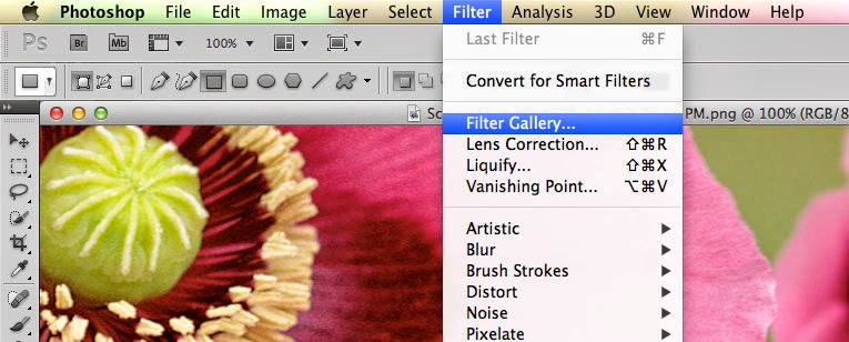
  • Filters. The filters are typically what we think of when we think of Photoshop, they are special effects that are applied to images to give them different looks. Each filter can draw out a different effect, color, or reduce those things. Filters work even better when you know how to pair them with other abilities of Photoshop. To get to the filters, simply look at the top menu bar, click Filter > Filter gallery > then choose a filter. 
  • Keyboard shortcuts. There are several keyboard shortcuts that will help you do your work even faster and look like a pro. 
    • V= move tool
    • F= flips through screens
    • Space= temp hand key
    • B= paintbrush
    • D= Sets the background/foreground colors as default
    • X= flips between foreground and background colors
    • E= Eraser
    • S= Stamp tool (also clone tool)
    • W=Quick selection
    • Ctrl+J= duplicates layer you have last selected
  • Color enhancing. Color is one of the main things you do with Photoshop, you want your photos to appear full of life and be attractive. Two of the main things you can do here are toggle with saturation and vibrance. Vibrance is the ability to increase the saturation of colors that are less saturated; so, it tends to balance out the color in a photo. Saturation is the ability to increase the intensity of all the colors in your image; so the intensity differences are still there but they're all more intense. 
  • Add sharpness and detail. Adding sharpness to your image can make it look much more detailed and awesome. If you are unsure of how much sharpness to add, then just add a little; if you add to much, it can make the photo look bad and that could have a worse effect than not sharpening at all. 
If you are looking for a graphic designer in Chicago, then contact Integraphix. We have done graphic design work for some of the top brands in Chicago and would love to help yours! 

Monday, May 19, 2014

5 Graphic Design Tips for Getting Business

Being a Chicago graphic designer or a graphic designer in any other city means having to work hard to get clients; especially in an economy like this one where you have people cutting costs and often step one to that is postponing creative expenses.

You might have design skills that are to die for but getting a solid stream of work in tougher times hits designers of all skill levels. So what can you do to get clients to be willing to keep using your services?


  1. Join sites. There are sites out there that you can join to get your name out there and win projects. Sites like Sitepoint Forum are great for this. If you want to join freelance marketplace sites, you can but they sometimes charge a commission on jobs won; they can also have ridiculously low paying jobs, like a brochure for $5. The more you get your name out there and build up a client list, the more willing are other clients to sign you; when you are in-demand, people will notice and want you to do work for them as well. 
  2. Network yourself. Network with people and get to know other graphic designers, go to networking events. Not only will you meet fellow graphic designers but you will also meet people who need graphic design clients who will be willing to see your work. In addition to this, you can create a blog and give helpful articles and showcase your work there as well. The more helpful your posts more people see them, the bigger your follower list becomes. You will have your choice of free blogging sites like Blogger, Wordpress, and a couple others. 
  3. Get on social media. Having a business page on Facebook, Twitter, Google+, Pinterest, and maybe other platforms like Tumblr, you can really get your work and tips out there for people to appreciate and share. Show the world what you can do in a fun and easy way like social media. 
  4. Be organized. Be organized, have a filing system, have reminders and calendars. Do what you have to so you know when jobs are due and how much time you have with all your other jobs. If you start to fall behind, then your reputation can take a hit and orders can start to decline. 
  5. Be dedicated. Know that your clients expect a great result and that you have to deliver it to them. It's great to deliver but it's even better to over deliver to clients. Also, keep in touch with them. 
Being a top graphic designer is hard and demanding. If you are looking for a great graphic designer, then contact Integraphix

Thursday, April 10, 2014

Deal from InkyDeals - Colossal Bundle

If you are in the design business, then you should check out InkyDeals. Right now, they have a deal going that has this package available for $49-$79 and is worth $4,355-$10,063. 

InkyDeals wanted to create a huge bundle and with good discounts, this Colossal Bundle deal proves they were serious. With the bundle, you get: 

The New Colossal Bundle
  • - 117 Vector Sets worth $1,755
    - 425 Vector Illustrations worth $1,700
    - 40 T-shirt Designs worth $600
    - 18 Texture Packs worth $265
    - Tatianna Font Family worth $35
    DesignTNT Massive Library
    - 233 Vector Sets worth $2,290
    - 101 Web & Print Resources Packs worth $1,070
    - 109 Photoshop & Illustrator Addons worth $1,036
    - 69 High-Resolution Texture Packs worth $729
    - 67 Brushes Sets worth $486
    - 10 Premium Tutorials worth $97
    With the bundle, you get an extended royalty license, which is a big deal since it means you can use the stuff in the bundle for unlimited personal and business reasons; go ahead and use it for sales and merchandise. 
    You get a money back guarantee that features a no questions asked return of your money and you can even keep the bundle. 
    If you like a tasting, then you can download a freebie version. 
    Check out the page for InkyDeals here
    **Note, this was not a paid endorsement. Opinions and reviews are from Integraphix. This is a cool product worth checking out. If you have any questions, contact Integraphix. We are a Chicago based graphic design firm that also works in marketing and web design; we work nationally. 

Friday, March 28, 2014

How To Understand Colors and Their Impact Part 2

Yesterday we had a post about colors and how they can impact people emotionally, physically, and mentally. The reason for these posts is because as a graphic designer, you will be using color in your designs and sometimes, it will matter what colors you choose simply due to how they will affect your audience.


  • Orange (Orange): orange gives us a feeling of stimulation since it is a combination of yellow and red and affects us in an emotional and physical way. It allows our minds to think of things that bring us comfort, physically; it makes us think of things like food, warmth, shelter, etc. This is often seen as a fun color for our minds. 
    • When positive: orange gives us thoughts of comfort, food, warmth, security, passions, fun, good times etc. 
    • When negative: it can give us feelings of frustration, immaturity, and deprivation. 
  • Pink (Pink): Pink is a combination of red and white, however, due to the white, this color often soothes us instead of stimulating. It does often represent femininity, like a sense of feminine power. It can bring us feelings of nurturing. 
    • When positive: it brings us tranquility, nurturing, love, survival
    • When negative: it can make us feel inhibited, emasculated, weak
  • Grey (Grey): This color actually is pretty easy on the mind, it does not bring much to the mind in terms of emotion, mentality, or anything physical. It is a neutral color, for the most part. It is sometimes seen as suppressive and create a sense of hibernation. 
    • When positive: neutral. 
    • When negative: it can make us feel unconfident, damp, depressed, lethargic. 
  • Black (Black): Black often brings us considerable impact on our mind and body. It can make us feel protected and takes in all the energy around us. It can be negative in terms of enshrouding our personalities when there is too much of it around. However, it can help us see clearly because there are no distractions and give us a sense of sophistication. 
    • When positive: sophisticated, glamorous, secure, safe, efficient. 
    • When negative: oppressed, cold, menacing, heavy. 
Next time you consider the colors for a graphic design job, consider them carefully. If you have any questions about this, contact Integraphix - a Chicago graphic design studio. 

Thursday, March 27, 2014

How To Understand Colors and Their Impact

As a graphic designer, you will likely use color in your designs (I say likely because you might have a black and white design once in a while). Believe it or not, colors have an impact on people, they manipulate us without us even realizing it.

Here is how the colors have an impact on us:


  • Red (Red): This color affects us physically. It often grabs our attention first among other colors because the mind perceives that object as closer to us than it really is. It can increase our heart rate and give us the impression that time is going faster. 
    •  When it affects us in a positive way, it can make us feel stronger, more courageous, warm, energetic, masculine, and excited. 
    • When this color affects us negatively, it can make us defiant, aggravated, and strained. 
  • Blue (Blue): This color affects us intellectually/mentally. It often has that soothing effect on us because objects of this color seem more distant and encourage openness. Although, it can be perceived as unfriendly. 
    • When this color affects us positively, it gives us the feeling of intelligence, communication, trust, efficiency, serenity, logic, calmness. 
    • When it is negative, it has a feeling of coldness, emotionless, and unfriendliness. 
  • Yellow (Yellow): This color affects us emotionally. It is a very strong color and will often give us a good feeling, like hope, confidence, and optimism. It is said to lift our spirits. 
    • When this color affects us positively, it gives us feel ins of optimism, confidence, self-esteem, extraversion, friendliness, and creativity. 
    • When negative, it can provoke irrationality, fear, depression, and anxiety. 
  • Green (Green): This color affects our balance (not walking balance). Green is perceived to the eye as a color that creates rest/peace and creativity. It is the color of all things balance. It is a color that often represents health due to being the color of healthy vegetation. 
    • When positive, this color creates harmony, balance, refreshment, love, rest, peace, and reassurance. 
    • When negative, boredom, stagnation, and blandness. 
If you have questions about what colors to use in your graphic design, then contact Integraphix

We will have more posts discussing color.