Tuesday, August 12, 2014

Logo Design Trend Predictions for 2015

So many changes happen in the creative industry that if you step away for more than a minute, you'll have some catching up to do. When it comes to graphic design trends, they change constantly. The "cool" way to design something last year might not be so cool today. That being said, we are already thinking about the trends that graphic designers will fly to in 2015 (I know, it's crazy that we're already thinking about 2015).

The graphic design trends for logos in 2015 will be **drum roll**

The typography based logo
The typography based logo one that is entirely written. These logos exist already but it is predicted that they will flourish next year.


The incomplete logo
This one will make you think, "Is that the whole thing?" Yes, yes it is. It is as if the company made a logo, put it on a cutting board, then chopped part of it off.


Hand-drawn logos 
These look like they are hand-drawn, whether they actually are or not. Why this style? It is original and separate from things we have really seen before. These logos exist already but are not very common.


Letter stack logos
Instead of say the company name in one, horizontal line, the logos will separate the name into sections and then stack it all up. This one looks nice but can create difficulties saying the brand name if you have never seen it before.


Recurring patterns in the design 
This one is actually pretty cool. The logo will feature a design and then have it repeat; often times, the repetition of the design flows together so no part of the
repetition stands alone. As a Chicago graphic designer, this one is one of my favorites.


Transparent overlays

Typically done with shapes, each shape will look transparent and be influenced by the other sections of the logo. Example, having a red box and a blue box with the overlay in the middle being purple so it looks like each box is transparent. The same thing with circles, hexagons, etc.


Bright colors
Expect to see yellows, oranges, reds, and other bright colors be the norm.


Crests
They look preppy and edgy.


Geometric shapes
Using triangles, squares, and other geometric shapes will be a hit because we all like shapes, right?


Double meaning symbols
These are actually really cool; it is when the logo will incorporate something from the company into the logo and have it double as a letter, object, etc. Example: a sushi place using three chopsticks as the H in "SUSHI". Get it? This one can be done in a really sleek way if you find the right Chicago graphic design firm.


The negative space logo
Negative space is white space. Expect to see logos using white as the main color.

Thursday, July 10, 2014

How To Use Texture in Graphic Design

There are some very nice ways that you can use textures to create some spectacular designs. As a Chicago graphic designer, I love to use texture and create designs that are not seen everywhere you look.

Here, we have 5 ways that you can use texture in your next graphic design jobs and create exceptional designs that will be loved and feature pieces in your portfolio.


  1. Use nature. Don't be afraid to be inspired by texture you see in nature. See things like gravel, bark on trees, bricks, pine cones, etc. If it is in nature, then chances are that it has a great texture that you can be inspired by to create art. Nature is full of texture, don't ignore it or risk ignoring a source chock full of inspiration. How can you capture these textures? Well, you can either photograph them or perhaps draw them. 
  2. Use paint and make your own. If you have any paint brushes and paint, go ahead and make your own textures. Just use the brushes until you create something you like. 
  3. Use a pencil and draw your own. Make some scribbles and doodles and see what you come up with. Once you create something you like, you can scan it and play around with it in Photoshop. 
  4. Find stuff online (that's free). You can have a huge file full of textures you like by doing a simple Google search for free textures. Plenty of these are high quality and resolution that you can download. From there, you can adjust the texture to make it more your own. 
  5. Use stock images. Stock images can have some great designs in them. You can play around with them on Photoshop and create something beautiful. There are plenty of images you can find for free or if you have to pay for them, then you can do that also. Pick a piece of the image and use it. 
Creating something great for your next graphic design object does not have to be incredibly difficult. Once you find a groove to create great art, you can keep it in a file and use it like a "graphic design bank account" and take from it when you need some art. As a graphic design studio in Chicago, we at Integraphix are all about creating designs that push beyond convention. 

Wednesday, June 11, 2014

4 Quick and Easy Photoshop Tips for Beginners

Using Photoshop as a graphic designer is something you will do almost everyday, to some extent. Even if you do not use it a lot, you ought to know the basics if you want to be in graphic design. There are several basic tasks that you need to know to do.
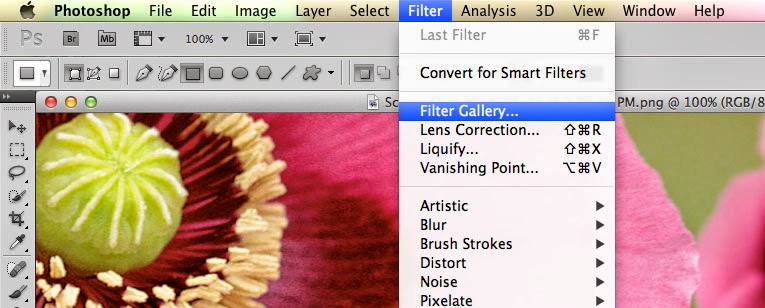
  • Filters. The filters are typically what we think of when we think of Photoshop, they are special effects that are applied to images to give them different looks. Each filter can draw out a different effect, color, or reduce those things. Filters work even better when you know how to pair them with other abilities of Photoshop. To get to the filters, simply look at the top menu bar, click Filter > Filter gallery > then choose a filter. 
  • Keyboard shortcuts. There are several keyboard shortcuts that will help you do your work even faster and look like a pro. 
    • V= move tool
    • F= flips through screens
    • Space= temp hand key
    • B= paintbrush
    • D= Sets the background/foreground colors as default
    • X= flips between foreground and background colors
    • E= Eraser
    • S= Stamp tool (also clone tool)
    • W=Quick selection
    • Ctrl+J= duplicates layer you have last selected
  • Color enhancing. Color is one of the main things you do with Photoshop, you want your photos to appear full of life and be attractive. Two of the main things you can do here are toggle with saturation and vibrance. Vibrance is the ability to increase the saturation of colors that are less saturated; so, it tends to balance out the color in a photo. Saturation is the ability to increase the intensity of all the colors in your image; so the intensity differences are still there but they're all more intense. 
  • Add sharpness and detail. Adding sharpness to your image can make it look much more detailed and awesome. If you are unsure of how much sharpness to add, then just add a little; if you add to much, it can make the photo look bad and that could have a worse effect than not sharpening at all. 
If you are looking for a graphic designer in Chicago, then contact Integraphix. We have done graphic design work for some of the top brands in Chicago and would love to help yours! 

Monday, May 19, 2014

5 Graphic Design Tips for Getting Business

Being a Chicago graphic designer or a graphic designer in any other city means having to work hard to get clients; especially in an economy like this one where you have people cutting costs and often step one to that is postponing creative expenses.

You might have design skills that are to die for but getting a solid stream of work in tougher times hits designers of all skill levels. So what can you do to get clients to be willing to keep using your services?


  1. Join sites. There are sites out there that you can join to get your name out there and win projects. Sites like Sitepoint Forum are great for this. If you want to join freelance marketplace sites, you can but they sometimes charge a commission on jobs won; they can also have ridiculously low paying jobs, like a brochure for $5. The more you get your name out there and build up a client list, the more willing are other clients to sign you; when you are in-demand, people will notice and want you to do work for them as well. 
  2. Network yourself. Network with people and get to know other graphic designers, go to networking events. Not only will you meet fellow graphic designers but you will also meet people who need graphic design clients who will be willing to see your work. In addition to this, you can create a blog and give helpful articles and showcase your work there as well. The more helpful your posts more people see them, the bigger your follower list becomes. You will have your choice of free blogging sites like Blogger, Wordpress, and a couple others. 
  3. Get on social media. Having a business page on Facebook, Twitter, Google+, Pinterest, and maybe other platforms like Tumblr, you can really get your work and tips out there for people to appreciate and share. Show the world what you can do in a fun and easy way like social media. 
  4. Be organized. Be organized, have a filing system, have reminders and calendars. Do what you have to so you know when jobs are due and how much time you have with all your other jobs. If you start to fall behind, then your reputation can take a hit and orders can start to decline. 
  5. Be dedicated. Know that your clients expect a great result and that you have to deliver it to them. It's great to deliver but it's even better to over deliver to clients. Also, keep in touch with them. 
Being a top graphic designer is hard and demanding. If you are looking for a great graphic designer, then contact Integraphix. 

Thursday, April 10, 2014

Deal from InkyDeals - Colossal Bundle

If you are in the design business, then you should check out InkyDeals. Right now, they have a deal going that has this package available for $49-$79 and is worth $4,355-$10,063. 

InkyDeals wanted to create a huge bundle and with good discounts, this Colossal Bundle deal proves they were serious. With the bundle, you get: 

The New Colossal Bundle
  • - 117 Vector Sets worth $1,755
    - 425 Vector Illustrations worth $1,700
    - 40 T-shirt Designs worth $600
    - 18 Texture Packs worth $265
    - Tatianna Font Family worth $35
    DesignTNT Massive Library
    - 233 Vector Sets worth $2,290
    - 101 Web & Print Resources Packs worth $1,070
    - 109 Photoshop & Illustrator Addons worth $1,036
    - 69 High-Resolution Texture Packs worth $729
    - 67 Brushes Sets worth $486
    - 10 Premium Tutorials worth $97
    With the bundle, you get an extended royalty license, which is a big deal since it means you can use the stuff in the bundle for unlimited personal and business reasons; go ahead and use it for sales and merchandise. 
    You get a money back guarantee that features a no questions asked return of your money and you can even keep the bundle. 
    If you like a tasting, then you can download a freebie version. 
    Check out the page for InkyDeals here. 
    **Note, this was not a paid endorsement. Opinions and reviews are from Integraphix. This is a cool product worth checking out. If you have any questions, contact Integraphix. We are a Chicago based graphic design firm that also works in marketing and web design; we work nationally.