

Monday, May 4, 2015

Tuesday, April 28, 2015
Coca-Cola Alters Classic Ribbon to Embrace Genuine Friendship
 A classic, nay, iconic sign of true friendship is the fist bump. Coca-Cola has decided to embrace that sign of affection and connection in its new campaign in Latin America.
 The goal of the campaign is to engage teens in a conversation about being true friends, especially in difficult moments. In the teenage years, it is a vulnerable time of social pressure, especially in 2015 with cyberbullying. Coca-Cola has made short web films showing teens stepping up for their friends in difficult times.
The graphic design will be featured on packaging, merchandise (t-shirts & phone cases), and other media.
As a Chicago graphic design studio, we love the simplicity of the design that still builds an incredible message. Call or email Integraphix about how your business can create great graphics to build brand awareness or awareness for a cause.
Tuesday, April 21, 2015
A Quick and Easy Way to Create Graphics
If you are into blogging, cool social media posts, or just like the idea of creating images & graphics for things (maybe invitations, posters, album covers, etc.) but you are not that great with Adobe Photoshop, InDesign, or Illustrator, then we have a savior for you.
Canva.
If you are unfamiliar with Canva, for whatever reason, we we will give you a quick and easy tutorial of how to use it.
1. Sign up form account.

2. Choose a design template that you'd like to use. Canva conveniently labels them so you know what size works best for your project. There are more options than in this picture but we can only take screen shots that are so big, you know?

3. Choose your project. For this example, we will choose the "social media" template. There are templates for specific social media platforms, emails, marketing materials such as business cards, posters, flyers, menus, etc. You can also choose templates for documents and presentations, blogging & ebooks, events, advertising tools for both print and web. Yeah, you have a lot of options.

4. Get to creating. From here, you can choose your various options.
a. Layouts that are pre-designed. Some of the layouts are free to use and some cost $1. If you choose a layout, you can manipulate it how you want. You can change font, images, colors, etc.

b. Text. There are several text layouts that you can choose from, again, some are free and some cost $1. If you don't see that you like, you can add in your text that is structure-free. As a Chicago graphic design studio, even we approve of the text options they offer (although, they do offer Lobster and a few other iffy fonts…).
 c. Backgrounds. Want a cool background? They have plenty of options, free and $1. Again, you can change the color of the background. Top left corner, you can see the color options (the + is so you can create your own color).
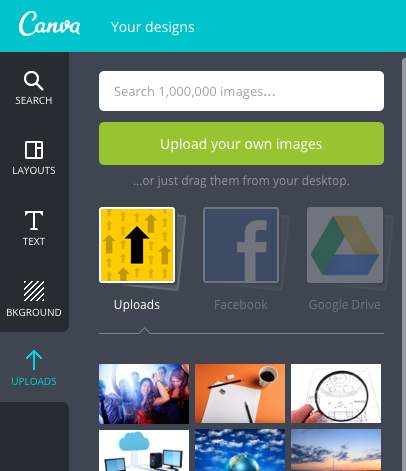
d. Uploads. You can upload your own photos to use in your creations, too! You can connect to Facebook and Google Drive to attach photos as well.
Are you excited to use Canva? We sure hope so! If you have any questions, don't hesitate to contact Integraphix, a Chicago graphic design agency with over 25 years experience.
Canva.
If you are unfamiliar with Canva, for whatever reason, we we will give you a quick and easy tutorial of how to use it.
1. Sign up form account.
2. Choose a design template that you'd like to use. Canva conveniently labels them so you know what size works best for your project. There are more options than in this picture but we can only take screen shots that are so big, you know?
3. Choose your project. For this example, we will choose the "social media" template. There are templates for specific social media platforms, emails, marketing materials such as business cards, posters, flyers, menus, etc. You can also choose templates for documents and presentations, blogging & ebooks, events, advertising tools for both print and web. Yeah, you have a lot of options.
4. Get to creating. From here, you can choose your various options.
a. Layouts that are pre-designed. Some of the layouts are free to use and some cost $1. If you choose a layout, you can manipulate it how you want. You can change font, images, colors, etc.
b. Text. There are several text layouts that you can choose from, again, some are free and some cost $1. If you don't see that you like, you can add in your text that is structure-free. As a Chicago graphic design studio, even we approve of the text options they offer (although, they do offer Lobster and a few other iffy fonts…).
c. Backgrounds. Want a cool background? They have plenty of options, free and $1. Again, you can change the color of the background. Top left corner, you can see the color options (the + is so you can create your own color).d. Uploads. You can upload your own photos to use in your creations, too! You can connect to Facebook and Google Drive to attach photos as well.
Are you excited to use Canva? We sure hope so! If you have any questions, don't hesitate to contact Integraphix, a Chicago graphic design agency with over 25 years experience.
Tuesday, April 14, 2015
Is Hillary Clinton's Logo Really That Bad?
 This is the new logo for Hillary Clinton's 2016 Presidential run. Right away, the logo design came under fire from critics about its lack of… everything.
Some people have compared her logo to a speed bump (if you flip the logo counter-clockwise 90 degrees). Some people have said the arrow makes it look like the "I'm with stupid" shirts. One of the more clever comparisons is that the logo looks like it should be on a 90s windbreaker or sailor shirt. One of the most common comments about the logo is just how much it reminds people of the FedEx logo (because of the arrow pointing right).
The graphic designers at our Chicago graphic design studio have some input.

Every professional logo designer knows that a logo has to look good in every circumstance. One very common circumstance to consider is what the logo will look like in B&W. After all, not everything is printed in color.
This is what Hillary's new logo looks like in B&W. You can barely tell that there's an arrow in the logo. Without the arrow, the whole messaging behind the logo is lost.
It looks like an "H" with something being pushed out of it. The colors are too similar in value for being directly adjacent with no separation.

Another thing that is wrong with the logo is that the arrow makes the logo too heavy on the right side. The "H" looks like it will take a tumble to the right, as seen in the image.
The large arrow makes the logo feel unbalanced and too heavy. A good graphic design company will tell you that the best logos have balance.
So what do you think of Hillary's new logo? (No political bias, please). Do you think it is good or could it use some tweaking? Perhaps you can recommend your favorite political logo?
Let us know! Reply in the comments or email Integraphix with your thoughts about Hillary Clinton's 2016 campaign logo.
Tuesday, March 31, 2015
10 Common Mistakes Graphic Designers Make
 It can be easy to make a mistake as a graphic designer, especially when you are not a very seasoned graphic designer. As a Chicago marketing company with a team of experienced graphic designers, our team put together a list of 10 common mistakes that are made by designers to help you grow as a designer with excellence!
- Having Multiple Typefaces. Never use more than three fonts per layout; in fact, our team doesn't advocate using more than one or two, just to be safe. If you use a logo in a layout, you can have continuity with the logo by using the typeface from the logo with other copy.
- Abusing Emphasis. Use font tricks carefully to create emphasis, don't use too many or it can be counter-productive.
- Double Spacing. If you have a habit of hitting the space bar twice after a period, you'd better nix that habit. It can be distracting and is often considered taboo by typesetters.
- Using All Caps. Using all caps in a design can look amateurish and be distracting.
- Underlining text. Underlining text is only okay when showing there is a link. Underlining text was originally created as a way to show there was special text when bolding wasn't around (with typewriters).
- Not Knowing where commas and periods go with quotes. The comma and the period will always go inside the quotation marks when using a quote. Other punctuation marks, such as question marks and exclamation points, will go outside the quotation marks unless they are part of the quote.
- Not Knowing Dashes. There are three types of dashes. You can use the hyphen or minus sign, which is used for breaking apart words and to prevent weird spacing. There's the en dash ' ' ' which is called that because it is often wider than an "n" and should be used to replace "to", such as 9'12 p.m.. Finally, there's the em dash, which is the longer option of the dashes here and is used to split up sentences, much like a semicolon.
- Ladders. These are multiple hyphenation that appear on consecutive lines. Do not put more than two consecutive hyphens or it will steal the spotlight in your copy.
- Rivers. If you really want to justify your type, be on the look out for big spaces and gaps, which appear vertically in your type, these are called "rivers of white space". You generally see these in newspapers.
- Special characters. We are talking about things like the copyright, registered trademark, ™, and ellipses. Use these when using a brand's name or something that has one of these connected with it (except for the ellipses). Use an ellipses when omitting part of a quote.
Do you want to know more trips that can help your career as a graphic designer? Then email Integraphix, a Chicago graphic design company.
Subscribe to:
Posts (Atom)