Tuesday, June 9, 2015

Why Has the Wheaties Box Stayed so Iconic?

With so many things coming and going in the world, especially with branding and package design, it is hard for brands to keep old designs relevant and intriguing.

General Mills has been able to do that for one of their flagship brands, Wheaties. The box's design has stayed the same over the years, with some very minor modifications (such as the addition of the shadow to "Wheaties" and changing the shade of the shadow, etc.)

One thing that is effective, and popular, in package design is using bright colors. Next time you are at the store, take a look at the packaging on the shelves, your eyes will gravitate towards the packaging that use bright colors, such as orange. Bright colors get noticed twice as much as dark or mute colors.

Another reason why the Wheaties box is still iconic to this day is what we can expect from it, this is two-fold.

  • The first part is that we can expect a quality cereal that is valued by families, especially moms, and we will like the taste of. Part of great package design is having something worthy of being in that package. People will be intrigued by a product when they see a cool design but if the product's contents don't live up to the hype of the packaging, consumers will stop caring about the packaging and the product altogether. 
  • The second part is that we can expect an incredible and noteworthy athlete to be on the cover. This represents greatness, along with their tagline, "The Breakfast of Champions". Consumers now care about the quality of the product inside but also what the product represents. To change the package design would impact the love and care consumers have towards the product & its meaning on their lives. It sounds stupid but it's true; look up how much people cared about the design of the Tropicana cartons
Great package design begins with great graphic design. The colors have to match, the fonts have to look good and be readable, and there has to be good usage of whitespace and images. Wheaties has accomplished that and it hasn't done anything to mess with that. 

Tuesday, June 2, 2015

New IHOP Logo for the Digital Age

IHOP has shown that it is always willing to greet the next challenge on the web. They are a 60 year old company that excels at social media marketing, blogs, and now emoticons. In fact, they even rebranded with a new logo design to keep up with the digital age.

Many logo design analysts have mentioned that the O and P of "IHOP" make a pair of eyes and nose. IHOP is now embracing that find that even added a red semi-circle to complete the face. This face Mimicks emojis found on the web.

Another great realization about this new logo is that it captures the spirit of IHOP and its customers; people go in hungry, eat delicious food, then leave happy. It's part of their tagline! Happy memories are shared by people at IHOPs and some are even created there.

Just because your business is old, or "established", doesn't mean it can't or shouldn't evolve. Businesses have to keep up with consumers or they will be left behind. If your business is in need of some updating, email or call Integraphix, a graphic design studio and creative marketing agency in Chicago.

Tuesday, May 19, 2015

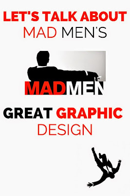
Mad Men May Be Gone But Its Wonderful Graphics Live Forever

Every TV show has a certain style to it, especially its art and graphics. They are what set the show apart aside from the characters and the show in its entirety.

When a TV show has great, unique graphics, images, and artistic style, you recognize it all right away. Let's look at Mad Men's graphics and style for a minute. The red and white font colors (though "men" sometimes appears in black), and the sans serif typeface, are not unique to Mad Men. Other shows have used that typeface and certainly those two colors. However, when put all together, it becomes something special to Mad Men, especially when you look at how the show's name is split between the two colors (notice the emphasis on the "Mad" since it's in red?)

What is really special about the artistic style of the graphic design for Mad Men is the B&W figures, such as what appears to be Don Draper in the main image of the show. We also see a faceless, ambiguous, B&W man falling during the opening title sequence, seen here.

These faceless, 2-dimensional characters really don't stretch or further the artistic world but they are special, unique, and downright cool. No other show utilizes this style of art and it is easily identifiable by anyone who has even heard of Mad Men. These figures bring something incredibly unique to the table as well, we are able to become those figures since they have no faces. The graphic design team who created these figures made them faceless for a reason (and not because they couldn't draw faces); they wanted viewers to be able to be in the place of those "people".

This is what great, unique, and creative graphic design can do for a company, TV show, movie, or anything else, really.

A great professional graphic designer can identify some nugget of uniqueness in a project and build that to be a "competitive advantage" for a design; that objective was met and exceeded by the team who made this art. If you want that for your business, then call or email Integraphix, a Chicago graphic design studio.