Wednesday, December 17, 2014

What You Need to Know About Instagram's 5 New Filters

For the first time in more than two years, Instagram has released new filters for us to go gaga over. Now, 300-million photographers have five new ways to make their photos look fabulous. Sorry, Kelvin filter, you get no love, still.

Filters are what have made Instagram a delight to use; they enable us to make our mundane photos look professional and aesthetically pleasing with stylish tones and artsy style.

Per the usual deal, the filters have names that do not make a whole lot of sense, unless you know the mentality behind the creators. Right now, the filters are unknown but soon enough, they will be as known as the other filters. We will be able to look at a friends picture and say, "Yup, that's the slumber filter, alright."

So what are these filters

Crema. The crema filter delivers a smooth, creamy, luxurious look. The designers over at Instagram named it that because it does just what we think it would do from the name- it gives a warm, yet cool effect to the image.


Ludwig. The Ludwig filter gives us a minimalistic design and look that is done via taking colors away while enhancing light in the photo. It was named after the famous architect Ludwig Mies van der Rohe who is known for the "less is more" mentality.


Perpetua. This filters gives photos an organic, earthy look via utilizing green and blue hues. It was named after the Cape Perpetua forest in Oregon.


Slumber. No, this one will not put you to sleep; rather, it will give your photos a vintage look with some desaturation and haze. If your photo has lots of blacks and blues, it will look even better.


Aden. This one is reminiscent of pastels and works beautifully with portraits and photos that have some harsh light. No knowledge of why it was named Aden, though. 

These new filters seem very cool. As a Chicago graphic design company, we tend to use Instagram a lot for showcasing work and think these filters will do a great job. 

Our Chicago photography studio team is excited about them as well. If you are a highly visual business, then consider using Instagram, especially with these filters out; they will help your social media marketing go to a new level. 

Need a professional graphic designer to help your business look as good as the new Instagram filters? Then contact Intagraphix, a Chicago graphic design agency

Wednesday, December 10, 2014

Social Media Cards for Your Business

Social media marketing is a must for the vast majority of businesses out there, especially if it is a business that is just getting its legs beneath it in the last few years.

One way to promote your business with social media and other digital marketing efforts is to handout social media cards. These are like business cards but the focus is on your social media profiles. Each card has the platforms you use as well as the link to your direct account.

Why have these? Well, they are a great "leave behind" along with your business card. Since social media is so heavily engrained in business these days, businesses have to mention their social media accounts; putting this info on a business card can crowd the card.

Our Chicago graphic design team has made many social media cards, one company in particular that benefited from these cards was Phoenix Insurance -- an Allstate Insurance Agency in Libertyville.

Sedrik Newbern, an insurance agent in Libertyville, needed a great way to promote his social media accounts for the agency as well as his site. He came to our Chicago graphic design firm to create a social media card that was funky and effective. Some useful at networking events.

Our graphic designers used bright colors to attract the eye, while keeping the Allstate branding, that were appealing and trendy.

Does your business need a new way to promote its site and social media accounts? Then chat with Integraphix, a Chicago graphic design company. Not in Chicago? We have teams in NYC, LA, Phoenix, and Charlotte.

Wednesday, December 3, 2014

A Logo Redesign for a Chicago Dentist Office

Right around the six year mark, a long time client of our Chicago graphic design firm, Rubino Dentistry, updated their logo. Along with updating and redesigning a logo, Rubino rebranded their Park Ridge dental office.

On the right, you will see their updated logo; this design features the green branding and color scheme of the office, and the tooth symbol that was part of their old logo (below). As part of their rebranding, we altered the name from "Ross E. Rubino, DDS PC & Associates" to "Rubino Dentistry" since the former (still the official name but not operating name) was quite a mouthful. Their new name is easier to use on all forms of marketing, including print such as business cards, stationary, flyers, etc. Also, it is easier to use for digital marketing, such as social media marketing, search engine optimization, and more.

The new logo, in addition to many other print marketing pieces, such as letterhead and brochures, are able to give the company a look that is more modern yet elegant.

If you have not updated your logo or branding in the last 10 years, then it is time to update your logo. Don't want to update your logo but want to rebrand in other ways such as letterhead, slogan/taglines, color scheme, or some other way? Then contact Integraphix, a logo design agency in Chicago

We have designed logos for businesses in the following fields: medical, public relations/communications, marketing, landscape, legal, film, hospitality, financial, clothing, and interior design.

Wednesday, November 19, 2014

Does Image Size Affect Page Load Speed?

When you put stuff on a web page, it will slow down the page, the more you add on. You can't help it, you have to have text on a page and you have to put images on the page.

However, how can you make sure to have images on a page but still have a web page that loads in an efficient time frame? Does that matter if it loads slowly or not? While this post is inspired by our Chicago SEO squad, it matters for us professional graphic designers, such as our Chicago graphic design team, because we make images for websites-- images, graphics, logos, etc. So we need to know this stuff too!

Well, to start, it does matter for two reasons. Humans hate slow web pages. When you have a web page that loads slowly, a person will wait only a couple seconds before they bail. This will increase your bounce rate for search engine optimization rankings. Also, search engine crawlers hate slow web pages because that makes them do their job slower. A slow page will get penalized by search engines.

So what can you do to keep a page optimized with images, graphics, and such while keeping the page quick? Keep you images to a smaller file size, while keeping them at a good resolution. Images consume the most download bytes on a web page and take up the most amount of visual space. 

Optimizing images is both a delicate science and an intricate art.

Do you have questions about the information here or would like to hire a graphic designer? Then contact Integraphix, a Chicago marketing firm 

Wednesday, November 12, 2014

6 Things to Consider When Designing a Business Card

While the role of business cards have changed over the years, websites, social media, and other factors have taken over many of the responsibilities, a good business card is a must. It is what you leave with clients, connections, potential clients, etc. and it is how they remember your name and that they met you.

A bad business card will still accomplish those things but in a negative way. People will remember they met you but they'll see your card and have a poor association with you.

Here are 7 things to consider when designing a business card, according to the graphic designers at our Chicago graphic design agency 

  • The size of the card and the colors used. Decide how large you want the cards to be before you think about what the design will look like. If the card is too small for the design, then you will have a smushed card. Remember that the size of the card has to accommodate Bleed. For color, you can choose between RGB (red, green, blue) basis or the CMYK (cyan, magenta, yellow, and key/black) basis. It is often better to work in CMYK because it can mask colors better on light backgrounds and reduces the amount of color reflected by the paper.
  • Prepare the bleed area. If you are using a white background, then you do not need to worry about the bleed area. To prepare for this, you need to highlight the area surrounding the document. This is often about 3 mm thick of space but this will often depend on the printing company. 
  • Avoid the borders. This looks less classy when you use this method of design as well as it runs the risk of having lop-sided edges. Printers have a margin of error when cutting cards and having borders on the cards emphasizes any mistakes. 
  • Use colors that compliment each other. Colors that compliment each other will be aesthetically pleasing. You want to have colors that are consistent with your branding (colors on your site, social media, etc). 
  • Make sure it is readable. If you use fonts or font sizes that are too hard to read, then guess what? People will not read your card and it is rendered useless. When designing business cards, this is something that people forget to consider. 
  • Include important info. These days, that important info can be different than what it was in the past. Have your name, position, contact info (number, email, and social media), and possibly a QR code (be careful with these). 
Using a good business card is important. Make sure that your card is something you can be proud of. This means hiring a graphic design agency that knows how to make your designs to be proud of. Chat with Integraphix about your next design need! 

Wednesday, November 5, 2014

How to Make a Pinterest-Worthy Graphic for a Blog

There are lots of ways to create a graphic for your blog; however, for those who are not astute in Photoshop and Illustrator or those who have five minutes to create a blog graphic, here is a quick way to get the job done, according to our Chicago graphic design team.

  1. Find a great image to use. You need to start with an image that is worth using. This is perhaps the most important part. If you do not have a good image, it makes the whole thing hard to accomplish. Avoid images that are blurry, stretched, too dark or light, and other faults. As a graphic design firm in Chicago, we have a particular set of standards that a photo must meet but we trust that you can spot basic faults such as those. 
  2. Use an overlay. This is often done by adding in some shape (often with text) that is placed over the image. Colors like white, gray, or shadows are great for this; if you want to pick another color, as long as it matches, then go for it. A good trick here is to make the overlay a bit transparent so you can still see some of the image behind it. 
  3. Use a headline. If you have read previous posts on this blog, you may have read that it is good to have some contrast in images… that applies here as well. You can have the font color contrast with the color of the overlay.
  4. Add in your URL or logo. Having some way for readers to see your image and know it is you, just from the image and not the blog as a whole, is to add in your URL (site or blog) and/or your logo. Make them small and in a bottom corner but have them there. 
Having a good blog can be hard to do and maintain. Creating images for a blog can be even harder. That is why a Chicago marketing company like Integraphix exists! We have a whole team of copywriters and graphic designers that can help you get the blog you need! See what Integraphix can do for you! 

Wednesday, October 29, 2014

4 Graphic Design Tips to Dominate Your Social Media

Great graphic design is not just for creating ads, logos, and mascots; great graphic design can help you dominate your social media marketing as well by giving your posts something to help them stand out.

When your posts have a great image to go along with them, they get more engagement! Why? For one thing, possibly the main thing, is that it gives your post an appealing visual besides just text. Another reason is because an image can help the message from your post be more complete.

Now, before you just jump into designing graphics and images for your social media posts. There are some prime rules that will help you nail this process down.

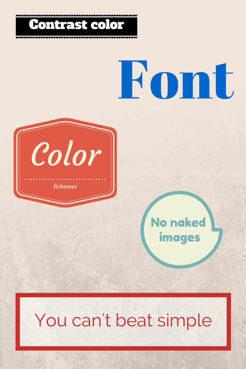
  1. Use contrast. Contrast will be great for making your images look sharp. It helps the text jump off the page and catch the eye. Colors that contrast well are not all that hard to choose, light and dark are the simplest ways to go. As a graphic design firm in Chicago, this is something we recommend to those who are venturing into graphic design for the first time. 
  2. Pick a font palette. If your company has a standard set of fonts, that is a great place to start. Having consistency with your fonts will really help build familiarity, great for branding! When you have a consistent set of fonts, it makes design easier and sleek. 
  3. Choose colors. Choosing a color scheme that is good for designs is sometimes hard but when you keep it consistent with your company's color scheme, it can also help with familiarity. Overall, consistency is key. Start with a couple colors and add more on from there; you want to avoid coming across as messy or confused with your colors. 
  4. K.I.S.S. - Keep it simple, Stupid! Sorry, you're not stupid but it's the acronym, you know? It can be very easy to get complex with images; you start with a cool, simple design and then just start adding in one cool thing after another. No, avoid that temptation. Keep the clutter to a minimum and make sure your message can be interpreted correctly! A professional graphic designer will always tell you that a messy graphic is a bad graphic, or they're a bad designer. Using too many fonts, colors, images, shapes, etc. should be avoided. 
Great graphic design can help any aspect of your business, even social media. Does your business need great graphics for social media? How about social media services? Email Integraphix or call us and chat with us about our services. 

Wednesday, October 22, 2014

5 Cliché Logo Designs to Avoid

We've said it before and we'll say it again, your logo is the 24/7 visual representative of your brand. Thus, having a logo that is not unique and uninspiring not only means poor top of mind awareness for your brand but also poor reach. As a professional graphic designer, this is a major thing to remember when designing a logo for a brand.

Your logo is the face of your company and should speak about who your brand is. A sure-fire way to get your brand to be lost in the crowd is to fall to one of these cliché design trends.
  1. Putting an arc on top. This is a wildly over-used trend. Sure, putting an arc over the top of the company name for a logo looked cool but not so much anymore. 
  2. Use helvetica in the logo. We get it, it can be a simple, nice font and sometimes when you type a company name in Helvetica, it can look appealing. However, just because something looks appealing doesn't mean it makes for a great logo. It is a great font for certain things, just not a logo. 
  3. Using comic-sans or papyrus font in a logo. These fonts can not only be cliché in a logo but also scream "amateur!" 
  4. Random shapes. The most popular option for this is to have random dots around the brand name but other shapes have happened too. 
  5. Having two letters overlap. This is especially common when the company is someone's name and both parts start with the same letter. 
There are some designs that people use in logos and they can be really cool, don't get us wrong. However, when you have a logo that is easily replicable and forgettable, then so is your company. Hire a graphic designer that can make a you a custom logo that speaks truth about your brand; hire Integraphix, we are a Chicago graphic design firm that specializes in logo design

Wednesday, October 15, 2014

How to Use Fonts Correctly

Believe it or not, using fonts is a big, big deal in the world of professional graphic design. It can be intimidating to the max. You have all sorts of fonts, sizes, weights, etc. A good font can make or break your design and help your message.

Getting a master grasp on how to use fonts can be a huge help in you becoming better a graphic design. As a Chicago graphic design firm, we have compiled a list of 5 ways to use fonts to your benefit.

  1. Use fonts for hierarchy. You can organize font to establish a hierarchy that will encourage people to read certain things first. The human eye will move towards the dominating elements of something such as the largest text and/or color. 
  2. Using fonts for contrast. Making titles and subtitles stand out can be done when you use fonts with great contrast to the rest of the image or graphic. You can do this with different colors (dark/light) as well as styles of fonts (uppercase/lowercase and types). Also, having different weights with your fonts helps, too. 
  3. Using fonts for sake of readability. When you use the wrong font, it can make your text very heard to read, which defeats the purpose of having the text there in the first place. Try to stay away from elaborate fonts and go for contrast such as white text on black backgrounds, etc. 
  4. Be imaginative and creative with your text. You can do things like putting your text into a shape; for example, write a body of text and then when you look at it, you see it is a dog, or something. 
  5. Use fonts that match the message and style of what you want to say. Using a papyrus font will not work when you are creating a graphic for your medieval era event. It just won't. A childish font won't work for you networking event for lawyers. 
Make sure you use fonts in an effective way. When you get careless is when your graphics suffer. As a graphic designer in Chicago, I have learned many ways to utilize fonts to be effective and creative. 

Does your business need design work done to help it stand out and grow? Then don't deny your business the help it needs. Contact Integraphix and see how we can help you! 

Tuesday, October 7, 2014

9 Ways to Make a Graphic Designer Cringe

There are lots of reasons to hire a professional graphic designer. For one thing, it means getting quality work that cannot be replicated, or at least easily. Why is this the case? Well, as a Chicago graphic designer, I can tell you that designers make sure to know the best trends and designs; graphic designers look at how things look on a grand scale as well as the smallest detail.

When something is "off" artistically, it can really get under the skin of a professional graphic designer. Here are some examples.


1. Bad Spacing (kerning). Yeah, it's not what you think it says!

(The Best Feature Flicks (F-L-I-C-K-S) On DVD)


2. Bad typesetting. 


3. Stretching text.
Notice how blurry that is?


4. Multiple Typefaces. Choose 1 or 2 and stick to it.


5. Big red text on posters. This is just overdone.


6. Looks like you just learned how to use Illustrator or other graphic programs


7. Was it designed by a Tween? We get it, animals and other cartoon/artsy things are cute. But less is more. 


8. Generic, cliché posters. Hey man! Come to this party! It'll be the best St. Patrick's Day bash ever! 


9. Saying something needs more pizzaz.


Tuesday, September 30, 2014

7 Fonts That Brands Need to Avoid

When creating a logo, the font choice is one of the hardest things to figure out. Why? Well, there are lots of rules when it comes to using fonts; you can't use certain fonts and others are out of style. On top of that, you have to choose a font that matches your style, brand, and reflects the type of company you are.

As a Chicago graphic designer, some of the fonts on this list make my skin crawl *shivers*.

  1. Helvetica. See what I did there? This is often ranked as one of the best fonts around and don't get me wrong, it's a very nice font. It is clean, precise, evenly weighted, and popular. However, the fact that it is so popular is why brands should try to move on. It has worked for so many companies that choosing this font will only make you another small fish in a densely populated pond. Major brands can get away with switching to this font if they don't use it already because they're a major brand. Until you become a Walmart, Coca-Cola, Nike, etc. then you have to abide by the rules of design
  2. Papyrus font. Unfortunately, Papyrus is not available in Blogger, which might be a good thing. This font is often considered one of the worst to be created, ever. Brands do not love this font, and they shouldn't. 
  3. Futura. It is indeed a nice looking font that speaks of progress. It has good weight that varies among the letters but is still easy to read. However, much like Helvetica, it is used by A TON of brands and using it will not allow you to stand out. As a graphic designer in Chicago, I like this font (and Helvetica) but I also like to allow brands to stand out from the crowd. 
  4. Arial. I did it again! Mwuahaha. Ok, so yes, this font can look clean but in the graphic designer world, it is somewhat of a joke. Remember the days when you'd type a document in Microsoft and it'd be in Arial unless you changed it? I do too. The problem with this font is that it has no attraction. 
  5. Jenna Sue. This is one of those fonts that makes me want to run away. It is just way too playful and not in a good/fun way. It has long, stick-like letters and it is often not modified to fit the brand. Yes, it is friendly but it is not a font to use if you want to be seen as professional, it is very forgettable. Very few brands use it that get away with it. 
  6. Gill Sans. This one always makes me think of Gill from The Simpsons because of the name "Gill" being in it. It is a nice font for presentations because it encourages relaxation instead of tension; however, it is forgettable and way, way too easy to get your hands on (this is a problem for unique branding). 
  7. Comic sans. Ahhhh this one is the worst of the worst. I once went to a company and they had their manuals printed in Comic sans. This is definitely a font that we all love to hate. No professional graphic designer will use this font unless you paid them a lot of money. In fact, there is a movement to get it banned from use. 
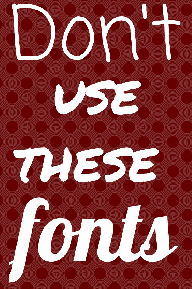
Because you were a good audience, we also say you should avoid the Lobster font. You'll see that at as "fonts" in our graphic up there. 

It sounds trivial to hate fonts but that is how design is. Just like in fashion, certain designs and styles are hated, it is no different here. If you are designing a logo and need help then contact Integraphix


Tuesday, September 23, 2014

What Type of Graphic Designer Do You Need?

Graphic designers do a ton of stuff. There is a whole buffet of duties and possibilities that a graphic designer in Chicago can do for a business. When it comes to finding a graphic designer for a business, it can be difficult to find the one you need if you are not familiar with the kinds of graphic designers out there.

So what kind of graphic designer do you need?

  • Package designer- a package designer designs and creates the packaging. 
  • Brand identity developer- This person will develop brand identities for a variety of organizations. 
  • Visual image developer- They create images and designs through 3D modeling techniques, photography, and and editing images. 
  • Visual journalist- They create info graphics that can be used for print and digital applications. 
  • Broadcast designer- They create visual designs and electronic media that is used on TV. 
  • Logo designer- They create the logos- these are the visual representation for a business. The logo is the key to a brand and their identity. 
  • Interface designer- They develop graphical user interfaces that coincide with work from a web developer. This is how a website functions and things interact. 
  • Illustrator- A person who is great with art and drawing but also has a design background. They create illustrations that stand for an idea, message, and perhaps 2D/3D images for stories. 
  • Web designer- The creator of graphics, layouts, and pages for websites, the front end of websites. 
  • Content developer- They create the written, graphical, sounds, videos, and other forms of media content. 
  • Multimedia- They create the graphics for sound and motion. 
What are the head positions with a graphic design firm
  1. Creative director- This person is in charge of a creative team that produces visuals for advertising, branding, etc. 
  2. Art director- This person manages and coordinates between production artists to create illustrations for projects. 
  3. Art production manager- This person manages the production such as efficiency and costs. 
Need a quality graphic designer for your business? Then contact Integraphix; we have graphic designers for each of the needs listed above. Get your business noticed! 

Tuesday, September 16, 2014

6 Common Advertising Mistakes to Avoid

Doing great advertising takes knowledge of what to do and what not to do. Here we have 6 advertising mistakes that need to be avoided. As a graphic designer, there is a good chance you will work in advertising and here are some tips to help you make sure you don't make classic mistakes.

  1. Piggy-backing off interest. This one seems like a smart move, to capitalize off of the success of another concept. However, it will not work out. It is not smart to try and associate yourself with things that have no relevance to your business. If your business is selling coffee, then don't try to place ads that feature puppies because we all know everyone loves puppies. As a graphic designer in Chicago, I have seen this done by some companies and it never looks good. 
  2. Event sales opportunities. While it might be the anniversary of some huge event in history, if it has no relevance to your business, then don't try to capitalize on the day. For example, the anniversary of D-Day will not tie into your business that sells flooring. It just won't. 
  3. Growing a large ego. Even if you are the company's CEO, President, CMO, placing yourself in the ad only shows desperation and lack of originality. Luckily, in my time as a Chicago graphic design firm owner, I have not had to place myself in any ads so I practice what I preach. Unfortunately, this is an all too common practice. 
  4. Running different ads that bear no resemblance. Sometimes, one might think that since ads are running on different media channels, they should be different. While that is a good idea, there should be consistency; something about the ads during an ad campaign should let people know that they are from the same company and related. 
  5. Running ads anywhere & everywhere. Place your ads in specific areas and media channels; you want to make sure your target market sees them effectively and efficiently. When you hire a graphic designer and they spend hours creating a print ad and you blast it everywhere, that gives the impression that the ad is just "whatever". Make the ad work for you. 
  6. Doing too many ads. Go with quality over quantity. Nobody likes the company that has ads going 24/7 and are literally everywhere! Overexposure is never effective and can even create a boomerang effect; the boomerang effect is when the response to something is opposite of what was intended. 
Do ads that you are proud of and will actually generate ROI. Hire an advertising agency with a great graphic design team. If you need great designs, then contact Integraphix

Wednesday, September 10, 2014

5 Tips for Fantastic Graphic Design

There are a lot of things about graphic design that make it great. What makes a great graphic designer truly great is their ability to see designs and concepts that others have not seen. You have to be able to think about great, artistic ideas that flow and stand out.

There are lots of things you can do to improve your stylish eye, here are 5 tips.

  1. Believe in contrast. Contrast is a simple yet aesthetically appealing concept. A simple use of contrast in your design is a great way to help it stand out. Using contrasting colors with background and graphics or font can make it pop; use a light background and a dark font or vice versa. From this platform, you can make it your own by adding in your creativity. 
  2. Make good choices with fonts. One of the worst things a designer can do is make a bad font choice. Do a Google search for "logo fails" (after reading this post) and some of the logo fails you'll see are because of poor font choices. You need to have a font that looks good, that furthers the message you're conveying, and is consistent. Have you ever looked at the font choices some companies use for things? It's pretty off-putting when they have a bad one, right? Have a good one for headings, then a subtler, complimentary one for body and subtitles. 
  3. Choose good colors. The color scheme is a large. large part of any design. Ask any Chicago graphic designer, New York graphic designer, or Los Angeles graphic designer and they will tell you that color schemes are major; they make or break a design. You can choose to go with color schemes that are popular or you can go with what speaks to you. 
  4. Don't let images go naked. A great tip for images is to add in some sort of frame or put them in a grid with other images. Using a single image with no sort of border can look amateurish. 
  5. Simple is always good. If you are not confident about using intricate designs or you prefer something simpler, then go with simple. No one will look at a good, simple design and think, "I wish this was busier." However, how many times do we look at busy designs and think, "Calm down!"In light of the Apple event, look at the difference between iOS 6 and previous with iOS7 and now 8; Apple went with simple, matte/flat designs over the previous designs that used lots of depth, bubbles, and busyness. 
If you are in need of great graphic design work, then contact Integraphix. We are a quality graphic design firm in Chicago and have offices in LA, NYC, North Carolina, and Phoenix. 

Tuesday, August 12, 2014

Logo Design Trend Predictions for 2015

So many changes happen in the creative industry that if you step away for more than a minute, you'll have some catching up to do. When it comes to graphic design trends, they change constantly. The "cool" way to design something last year might not be so cool today. That being said, we are already thinking about the trends that graphic designers will fly to in 2015 (I know, it's crazy that we're already thinking about 2015).

The graphic design trends for logos in 2015 will be **drum roll**

The typography based logo
The typography based logo one that is entirely written. These logos exist already but it is predicted that they will flourish next year.


The incomplete logo
This one will make you think, "Is that the whole thing?" Yes, yes it is. It is as if the company made a logo, put it on a cutting board, then chopped part of it off.


Hand-drawn logos 
These look like they are hand-drawn, whether they actually are or not. Why this style? It is original and separate from things we have really seen before. These logos exist already but are not very common.


Letter stack logos
Instead of say the company name in one, horizontal line, the logos will separate the name into sections and then stack it all up. This one looks nice but can create difficulties saying the brand name if you have never seen it before.


Recurring patterns in the design 
This one is actually pretty cool. The logo will feature a design and then have it repeat; often times, the repetition of the design flows together so no part of the
repetition stands alone. As a Chicago graphic designer, this one is one of my favorites.


Transparent overlays

Typically done with shapes, each shape will look transparent and be influenced by the other sections of the logo. Example, having a red box and a blue box with the overlay in the middle being purple so it looks like each box is transparent. The same thing with circles, hexagons, etc.


Bright colors
Expect to see yellows, oranges, reds, and other bright colors be the norm.


Crests
They look preppy and edgy.


Geometric shapes
Using triangles, squares, and other geometric shapes will be a hit because we all like shapes, right?


Double meaning symbols
These are actually really cool; it is when the logo will incorporate something from the company into the logo and have it double as a letter, object, etc. Example: a sushi place using three chopsticks as the H in "SUSHI". Get it? This one can be done in a really sleek way if you find the right Chicago graphic design firm.


The negative space logo
Negative space is white space. Expect to see logos using white as the main color.

Thursday, July 10, 2014

How To Use Texture in Graphic Design

There are some very nice ways that you can use textures to create some spectacular designs. As a Chicago graphic designer, I love to use texture and create designs that are not seen everywhere you look.

Here, we have 5 ways that you can use texture in your next graphic design jobs and create exceptional designs that will be loved and feature pieces in your portfolio.


  1. Use nature. Don't be afraid to be inspired by texture you see in nature. See things like gravel, bark on trees, bricks, pine cones, etc. If it is in nature, then chances are that it has a great texture that you can be inspired by to create art. Nature is full of texture, don't ignore it or risk ignoring a source chock full of inspiration. How can you capture these textures? Well, you can either photograph them or perhaps draw them. 
  2. Use paint and make your own. If you have any paint brushes and paint, go ahead and make your own textures. Just use the brushes until you create something you like. 
  3. Use a pencil and draw your own. Make some scribbles and doodles and see what you come up with. Once you create something you like, you can scan it and play around with it in Photoshop. 
  4. Find stuff online (that's free). You can have a huge file full of textures you like by doing a simple Google search for free textures. Plenty of these are high quality and resolution that you can download. From there, you can adjust the texture to make it more your own. 
  5. Use stock images. Stock images can have some great designs in them. You can play around with them on Photoshop and create something beautiful. There are plenty of images you can find for free or if you have to pay for them, then you can do that also. Pick a piece of the image and use it. 
Creating something great for your next graphic design object does not have to be incredibly difficult. Once you find a groove to create great art, you can keep it in a file and use it like a "graphic design bank account" and take from it when you need some art. As a graphic design studio in Chicago, we at Integraphix are all about creating designs that push beyond convention. 

Wednesday, June 11, 2014

4 Quick and Easy Photoshop Tips for Beginners

Using Photoshop as a graphic designer is something you will do almost everyday, to some extent. Even if you do not use it a lot, you ought to know the basics if you want to be in graphic design. There are several basic tasks that you need to know to do.
  • Filters. The filters are typically what we think of when we think of Photoshop, they are special effects that are applied to images to give them different looks. Each filter can draw out a different effect, color, or reduce those things. Filters work even better when you know how to pair them with other abilities of Photoshop. To get to the filters, simply look at the top menu bar, click Filter > Filter gallery > then choose a filter. 
  • Keyboard shortcuts. There are several keyboard shortcuts that will help you do your work even faster and look like a pro. 
    • V= move tool
    • F= flips through screens
    • Space= temp hand key
    • B= paintbrush
    • D= Sets the background/foreground colors as default
    • X= flips between foreground and background colors
    • E= Eraser
    • S= Stamp tool (also clone tool)
    • W=Quick selection
    • Ctrl+J= duplicates layer you have last selected
  • Color enhancing. Color is one of the main things you do with Photoshop, you want your photos to appear full of life and be attractive. Two of the main things you can do here are toggle with saturation and vibrance. Vibrance is the ability to increase the saturation of colors that are less saturated; so, it tends to balance out the color in a photo. Saturation is the ability to increase the intensity of all the colors in your image; so the intensity differences are still there but they're all more intense. 
  • Add sharpness and detail. Adding sharpness to your image can make it look much more detailed and awesome. If you are unsure of how much sharpness to add, then just add a little; if you add to much, it can make the photo look bad and that could have a worse effect than not sharpening at all. 
If you are looking for a graphic designer in Chicago, then contact Integraphix. We have done graphic design work for some of the top brands in Chicago and would love to help yours! 

Monday, May 19, 2014

5 Graphic Design Tips for Getting Business

Being a Chicago graphic designer or a graphic designer in any other city means having to work hard to get clients; especially in an economy like this one where you have people cutting costs and often step one to that is postponing creative expenses.

You might have design skills that are to die for but getting a solid stream of work in tougher times hits designers of all skill levels. So what can you do to get clients to be willing to keep using your services?


  1. Join sites. There are sites out there that you can join to get your name out there and win projects. Sites like Sitepoint Forum are great for this. If you want to join freelance marketplace sites, you can but they sometimes charge a commission on jobs won; they can also have ridiculously low paying jobs, like a brochure for $5. The more you get your name out there and build up a client list, the more willing are other clients to sign you; when you are in-demand, people will notice and want you to do work for them as well. 
  2. Network yourself. Network with people and get to know other graphic designers, go to networking events. Not only will you meet fellow graphic designers but you will also meet people who need graphic design clients who will be willing to see your work. In addition to this, you can create a blog and give helpful articles and showcase your work there as well. The more helpful your posts more people see them, the bigger your follower list becomes. You will have your choice of free blogging sites like Blogger, Wordpress, and a couple others. 
  3. Get on social media. Having a business page on Facebook, Twitter, Google+, Pinterest, and maybe other platforms like Tumblr, you can really get your work and tips out there for people to appreciate and share. Show the world what you can do in a fun and easy way like social media. 
  4. Be organized. Be organized, have a filing system, have reminders and calendars. Do what you have to so you know when jobs are due and how much time you have with all your other jobs. If you start to fall behind, then your reputation can take a hit and orders can start to decline. 
  5. Be dedicated. Know that your clients expect a great result and that you have to deliver it to them. It's great to deliver but it's even better to over deliver to clients. Also, keep in touch with them. 
Being a top graphic designer is hard and demanding. If you are looking for a great graphic designer, then contact Integraphix

Thursday, April 10, 2014

Deal from InkyDeals - Colossal Bundle

If you are in the design business, then you should check out InkyDeals. Right now, they have a deal going that has this package available for $49-$79 and is worth $4,355-$10,063. 

InkyDeals wanted to create a huge bundle and with good discounts, this Colossal Bundle deal proves they were serious. With the bundle, you get: 

The New Colossal Bundle
  • - 117 Vector Sets worth $1,755
    - 425 Vector Illustrations worth $1,700
    - 40 T-shirt Designs worth $600
    - 18 Texture Packs worth $265
    - Tatianna Font Family worth $35
    DesignTNT Massive Library
    - 233 Vector Sets worth $2,290
    - 101 Web & Print Resources Packs worth $1,070
    - 109 Photoshop & Illustrator Addons worth $1,036
    - 69 High-Resolution Texture Packs worth $729
    - 67 Brushes Sets worth $486
    - 10 Premium Tutorials worth $97
    With the bundle, you get an extended royalty license, which is a big deal since it means you can use the stuff in the bundle for unlimited personal and business reasons; go ahead and use it for sales and merchandise. 
    You get a money back guarantee that features a no questions asked return of your money and you can even keep the bundle. 
    If you like a tasting, then you can download a freebie version. 
    Check out the page for InkyDeals here
    **Note, this was not a paid endorsement. Opinions and reviews are from Integraphix. This is a cool product worth checking out. If you have any questions, contact Integraphix. We are a Chicago based graphic design firm that also works in marketing and web design; we work nationally. 

Friday, March 28, 2014

How To Understand Colors and Their Impact Part 2

Yesterday we had a post about colors and how they can impact people emotionally, physically, and mentally. The reason for these posts is because as a graphic designer, you will be using color in your designs and sometimes, it will matter what colors you choose simply due to how they will affect your audience.


  • Orange (Orange): orange gives us a feeling of stimulation since it is a combination of yellow and red and affects us in an emotional and physical way. It allows our minds to think of things that bring us comfort, physically; it makes us think of things like food, warmth, shelter, etc. This is often seen as a fun color for our minds. 
    • When positive: orange gives us thoughts of comfort, food, warmth, security, passions, fun, good times etc. 
    • When negative: it can give us feelings of frustration, immaturity, and deprivation. 
  • Pink (Pink): Pink is a combination of red and white, however, due to the white, this color often soothes us instead of stimulating. It does often represent femininity, like a sense of feminine power. It can bring us feelings of nurturing. 
    • When positive: it brings us tranquility, nurturing, love, survival
    • When negative: it can make us feel inhibited, emasculated, weak
  • Grey (Grey): This color actually is pretty easy on the mind, it does not bring much to the mind in terms of emotion, mentality, or anything physical. It is a neutral color, for the most part. It is sometimes seen as suppressive and create a sense of hibernation. 
    • When positive: neutral. 
    • When negative: it can make us feel unconfident, damp, depressed, lethargic. 
  • Black (Black): Black often brings us considerable impact on our mind and body. It can make us feel protected and takes in all the energy around us. It can be negative in terms of enshrouding our personalities when there is too much of it around. However, it can help us see clearly because there are no distractions and give us a sense of sophistication. 
    • When positive: sophisticated, glamorous, secure, safe, efficient. 
    • When negative: oppressed, cold, menacing, heavy. 
Next time you consider the colors for a graphic design job, consider them carefully. If you have any questions about this, contact Integraphix - a Chicago graphic design studio. 

Thursday, March 27, 2014

How To Understand Colors and Their Impact

As a graphic designer, you will likely use color in your designs (I say likely because you might have a black and white design once in a while). Believe it or not, colors have an impact on people, they manipulate us without us even realizing it.

Here is how the colors have an impact on us:


  • Red (Red): This color affects us physically. It often grabs our attention first among other colors because the mind perceives that object as closer to us than it really is. It can increase our heart rate and give us the impression that time is going faster. 
    •  When it affects us in a positive way, it can make us feel stronger, more courageous, warm, energetic, masculine, and excited. 
    • When this color affects us negatively, it can make us defiant, aggravated, and strained. 
  • Blue (Blue): This color affects us intellectually/mentally. It often has that soothing effect on us because objects of this color seem more distant and encourage openness. Although, it can be perceived as unfriendly. 
    • When this color affects us positively, it gives us the feeling of intelligence, communication, trust, efficiency, serenity, logic, calmness. 
    • When it is negative, it has a feeling of coldness, emotionless, and unfriendliness. 
  • Yellow (Yellow): This color affects us emotionally. It is a very strong color and will often give us a good feeling, like hope, confidence, and optimism. It is said to lift our spirits. 
    • When this color affects us positively, it gives us feel ins of optimism, confidence, self-esteem, extraversion, friendliness, and creativity. 
    • When negative, it can provoke irrationality, fear, depression, and anxiety. 
  • Green (Green): This color affects our balance (not walking balance). Green is perceived to the eye as a color that creates rest/peace and creativity. It is the color of all things balance. It is a color that often represents health due to being the color of healthy vegetation. 
    • When positive, this color creates harmony, balance, refreshment, love, rest, peace, and reassurance. 
    • When negative, boredom, stagnation, and blandness. 
If you have questions about what colors to use in your graphic design, then contact Integraphix

We will have more posts discussing color. 

Thursday, February 27, 2014

What You Need to Know as a Graphic Design Student

As a graphic design student, it can be stressful to think about all the things you need to know when entering the real world in your profession. Your job is to be creative and make creative things; the pressure to do that can make it hard to do that. So what are some things you should know if your course to become the world's next amazing graphic designer?


  1. There are few "firsts" in todays time; this means that the likelihood that you are alone in doing something is minimal. This can be very uplifting because the times when something seems impossible or strange, you can remember that someone else has (most likely) gone through that same scenario. In areas like graphic design, web design, marketing, and advertising, most things are actually just adopted and altered, very few things are original anymore. 
  2. You may be great at what you do but there is always someone better or knows something you don't. The lesson from this is to remain humble and not let success get to your head and make you feel invincible. If you get awesome at what you do, fantastic; however, if the "fame" gets to your head and you become difficult to work with, you will have no one to work with. 
  3. Set goals for yourself so you have something to aim at. How do you know you have accomplished something if you do not know where the end is? Better yet, where the beginning is? 
  4. It is hard work, it takes energy. You may have months that require you to create 15 logos, you will need to be energetic enough to get done what needs to get done and done well. 
  5. Getting your foot in the door can be tricky but it can be easier if you remember to embody characteristics like a great work ethic, energy, great personality, and patience. Remember to have the great personality and patience. The personality also means having a good self-image; so be humble yet confident and not self-depreciating and insulting. 
  6. Go for quality, not quantity, when curating your portfolio. It's better to have a few awesome examples instead of 20 mediocre. 
  7. A great way to get your foot in the door with places is to do internships. Don't just do one and then quit, do a few. If you can get paid, then that's great, but realize the vast majority of places do not pay. Also, do not waste your internship; learn and remember and then implement!
  8. When you are in the work force as a designer, get to know a printer and make them a close work-friend. Having a good relationship with a printer will be a lifesaver. 
  9. Ask questions and for opportunities. If you do not know the answer to something, ask. If you want to have your work included in an exhibit, ask. 
  10. Take criticism well. Some people do not do great at giving constructive criticism so don't beat yourself up if they don't. 
So go be confident in your efforts to become a real world graphic designer. As a Chicago graphic design firm, Integraphix loves the world of art and helping others get there. If you have any questions, contact us

Monday, January 20, 2014

Graphic Designer Trends Found in 2014

So 2014 is here and has been so for a few weeks. So far, so good. However, like in almost every industry, we see that there are things that are changing for graphic designers. The trends for the industry are taking a slightly new turn this year; some of these trends started taking shape in 2013 but they will really own the graphic design world this year.

As people, we tend to like change in things like art, fashion, design, web, etc. There is just something boring about these industries when they tend to become static and pump out the same concepts and designs time after time.

What are these trends? Let's find out.


  • One of the biggest trends we are already seeing quite a bit of this year is that the simple designs are what people want. In the past, we saw a lot of designs for logos and graphics that included dimension, perhaps a lot of chaos and anything else you could throw at it. However, in 2014, that mindset for graphic designers is out and the simple stuff is in. Look at logos that are being created or redesigned this year and you will notice this to be true. For example, look at Google's logo; it used to have dimension but not it is flat and much more simple. Want to know what's interesting? It looks even better yet being simpler. 
  • The second trend is that logos will be more creative. Yes, they will be simpler (as well as other graphic design work) but they will speak more about the company instead of being something random. 
  • The third is that more natural looks are in and having a lot of photoshop is gone, baby, gone. This is particularly true for models; instead of taking photos of people with a lot of photoshop and other editing to place on websites and magazines, etc, people are opting for graphic design work that has few edits and looks much more natural. 
Bottom line, if you want to stay current in the industry this year, you'd better realize the new trends or risk being left out in the cold. If you have any questions about graphic design, then contact Integraphix - a Chicago graphic design firm