Showing posts with label graphic designer in chicago. Show all posts

Tuesday, October 7, 2014

9 Ways to Make a Graphic Designer Cringe

There are lots of reasons to hire a professional graphic designer. For one thing, it means getting quality work that cannot be replicated, or at least easily. Why is this the case? Well, as a Chicago graphic designer, I can tell you that designers make sure to know the best trends and designs; graphic designers look at how things look on a grand scale as well as the smallest detail.

When something is "off" artistically, it can really get under the skin of a professional graphic designer. Here are some examples.


1. Bad Spacing (kerning). Yeah, it's not what you think it says!

(The Best Feature Flicks (F-L-I-C-K-S) On DVD)


2. Bad typesetting. 


3. Stretching text.
Notice how blurry that is?


4. Multiple Typefaces. Choose 1 or 2 and stick to it.


5. Big red text on posters. This is just overdone.


6. Looks like you just learned how to use Illustrator or other graphic programs


7. Was it designed by a Tween? We get it, animals and other cartoon/artsy things are cute. But less is more. 


8. Generic, cliché posters. Hey man! Come to this party! It'll be the best St. Patrick's Day bash ever! 


9. Saying something needs more pizzaz.


Wednesday, June 11, 2014

4 Quick and Easy Photoshop Tips for Beginners

Using Photoshop as a graphic designer is something you will do almost everyday, to some extent. Even if you do not use it a lot, you ought to know the basics if you want to be in graphic design. There are several basic tasks that you need to know to do.
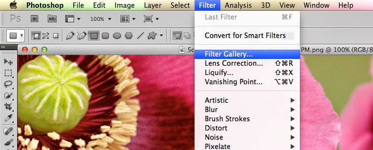
  • Filters. The filters are typically what we think of when we think of Photoshop, they are special effects that are applied to images to give them different looks. Each filter can draw out a different effect, color, or reduce those things. Filters work even better when you know how to pair them with other abilities of Photoshop. To get to the filters, simply look at the top menu bar, click Filter > Filter gallery > then choose a filter. 
  • Keyboard shortcuts. There are several keyboard shortcuts that will help you do your work even faster and look like a pro. 
    • V= move tool
    • F= flips through screens
    • Space= temp hand key
    • B= paintbrush
    • D= Sets the background/foreground colors as default
    • X= flips between foreground and background colors
    • E= Eraser
    • S= Stamp tool (also clone tool)
    • W=Quick selection
    • Ctrl+J= duplicates layer you have last selected
  • Color enhancing. Color is one of the main things you do with Photoshop, you want your photos to appear full of life and be attractive. Two of the main things you can do here are toggle with saturation and vibrance. Vibrance is the ability to increase the saturation of colors that are less saturated; so, it tends to balance out the color in a photo. Saturation is the ability to increase the intensity of all the colors in your image; so the intensity differences are still there but they're all more intense. 
  • Add sharpness and detail. Adding sharpness to your image can make it look much more detailed and awesome. If you are unsure of how much sharpness to add, then just add a little; if you add to much, it can make the photo look bad and that could have a worse effect than not sharpening at all. 
If you are looking for a graphic designer in Chicago, then contact Integraphix. We have done graphic design work for some of the top brands in Chicago and would love to help yours!