Showing posts with label chicago marketing company. Show all posts

Wednesday, January 28, 2015

How To Make a Print Ad That is Successful

Well, there is no real guarantee that an ad will always work; sometimes even very well-intended & put-together ads do not succeed. However, our Chicago graphic design agency has put together a few tips to help you understand what gives a print ad a great chance of success.

  • Give a headline that is attractive. The headline should be something that stops people in their tracks and gives some insight into the meaning of the ad; if the person only looks at the image and the headline, they should still know what the ad is talking about. This was more of an input by our professional copywriters. 
  • The ad is not about your business. I mean, yes, it will feature your business; what we mean by this statement is that the ad should not be saying, "Me me me! Look at me and how great I am!" but rather it should be, "You would be smart/a hero if you used our services" (Now, that's an over-simplification but you get the idea). The point is to focus on your consumer and make them feel like the hero of the ad and show them how your product/service helps them. 
  • K.I.S.S. Keep it simple, stupid! Your copy needs to be short and sweet. If it takes more than 10-15 seconds to read, it is too long. Be concise and to the point (think Twitter). Our Chicago marketing agency copywriters like to write the copy, then see what they can cut out from the copy while retaining the clarity & the message. 
  • Be visual. The graphic/image for your ad is as important as the copy is; this has to be appealing and draw the consumer in. Don't always be literal, either, it is okay to be abstract (as long as there is still a connection between the image and the message and it's not being forced). 
Having great advertising can be difficult when you don't have the time and/or skill. This is where hiring a Chicago graphic design agency would help! Contact Integraphix-- a Chicago graphic design company that would love to help your business be seen and gain popularity. 

Wednesday, December 3, 2014

A Logo Redesign for a Chicago Dentist Office

Right around the six year mark, a long time client of our Chicago graphic design firm, Rubino Dentistry, updated their logo. Along with updating and redesigning a logo, Rubino rebranded their Park Ridge dental office.

On the right, you will see their updated logo; this design features the green branding and color scheme of the office, and the tooth symbol that was part of their old logo (below). As part of their rebranding, we altered the name from "Ross E. Rubino, DDS PC & Associates" to "Rubino Dentistry" since the former (still the official name but not operating name) was quite a mouthful. Their new name is easier to use on all forms of marketing, including print such as business cards, stationary, flyers, etc. Also, it is easier to use for digital marketing, such as social media marketing, search engine optimization, and more.

The new logo, in addition to many other print marketing pieces, such as letterhead and brochures, are able to give the company a look that is more modern yet elegant.

If you have not updated your logo or branding in the last 10 years, then it is time to update your logo. Don't want to update your logo but want to rebrand in other ways such as letterhead, slogan/taglines, color scheme, or some other way? Then contact Integraphix, a logo design agency in Chicago. 

We have designed logos for businesses in the following fields: medical, public relations/communications, marketing, landscape, legal, film, hospitality, financial, clothing, and interior design.

Thursday, July 10, 2014

How To Use Texture in Graphic Design

There are some very nice ways that you can use textures to create some spectacular designs. As a Chicago graphic designer, I love to use texture and create designs that are not seen everywhere you look.

Here, we have 5 ways that you can use texture in your next graphic design jobs and create exceptional designs that will be loved and feature pieces in your portfolio.


  1. Use nature. Don't be afraid to be inspired by texture you see in nature. See things like gravel, bark on trees, bricks, pine cones, etc. If it is in nature, then chances are that it has a great texture that you can be inspired by to create art. Nature is full of texture, don't ignore it or risk ignoring a source chock full of inspiration. How can you capture these textures? Well, you can either photograph them or perhaps draw them. 
  2. Use paint and make your own. If you have any paint brushes and paint, go ahead and make your own textures. Just use the brushes until you create something you like. 
  3. Use a pencil and draw your own. Make some scribbles and doodles and see what you come up with. Once you create something you like, you can scan it and play around with it in Photoshop. 
  4. Find stuff online (that's free). You can have a huge file full of textures you like by doing a simple Google search for free textures. Plenty of these are high quality and resolution that you can download. From there, you can adjust the texture to make it more your own. 
  5. Use stock images. Stock images can have some great designs in them. You can play around with them on Photoshop and create something beautiful. There are plenty of images you can find for free or if you have to pay for them, then you can do that also. Pick a piece of the image and use it. 
Creating something great for your next graphic design object does not have to be incredibly difficult. Once you find a groove to create great art, you can keep it in a file and use it like a "graphic design bank account" and take from it when you need some art. As a graphic design studio in Chicago, we at Integraphix are all about creating designs that push beyond convention. 

Wednesday, June 11, 2014

4 Quick and Easy Photoshop Tips for Beginners

Using Photoshop as a graphic designer is something you will do almost everyday, to some extent. Even if you do not use it a lot, you ought to know the basics if you want to be in graphic design. There are several basic tasks that you need to know to do.
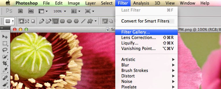
  • Filters. The filters are typically what we think of when we think of Photoshop, they are special effects that are applied to images to give them different looks. Each filter can draw out a different effect, color, or reduce those things. Filters work even better when you know how to pair them with other abilities of Photoshop. To get to the filters, simply look at the top menu bar, click Filter > Filter gallery > then choose a filter. 
  • Keyboard shortcuts. There are several keyboard shortcuts that will help you do your work even faster and look like a pro. 
    • V= move tool
    • F= flips through screens
    • Space= temp hand key
    • B= paintbrush
    • D= Sets the background/foreground colors as default
    • X= flips between foreground and background colors
    • E= Eraser
    • S= Stamp tool (also clone tool)
    • W=Quick selection
    • Ctrl+J= duplicates layer you have last selected
  • Color enhancing. Color is one of the main things you do with Photoshop, you want your photos to appear full of life and be attractive. Two of the main things you can do here are toggle with saturation and vibrance. Vibrance is the ability to increase the saturation of colors that are less saturated; so, it tends to balance out the color in a photo. Saturation is the ability to increase the intensity of all the colors in your image; so the intensity differences are still there but they're all more intense. 
  • Add sharpness and detail. Adding sharpness to your image can make it look much more detailed and awesome. If you are unsure of how much sharpness to add, then just add a little; if you add to much, it can make the photo look bad and that could have a worse effect than not sharpening at all. 
If you are looking for a graphic designer in Chicago, then contact Integraphix. We have done graphic design work for some of the top brands in Chicago and would love to help yours! 

Thursday, April 10, 2014

Deal from InkyDeals - Colossal Bundle

If you are in the design business, then you should check out InkyDeals. Right now, they have a deal going that has this package available for $49-$79 and is worth $4,355-$10,063. 

InkyDeals wanted to create a huge bundle and with good discounts, this Colossal Bundle deal proves they were serious. With the bundle, you get: 

The New Colossal Bundle
  • - 117 Vector Sets worth $1,755
    - 425 Vector Illustrations worth $1,700
    - 40 T-shirt Designs worth $600
    - 18 Texture Packs worth $265
    - Tatianna Font Family worth $35
    DesignTNT Massive Library
    - 233 Vector Sets worth $2,290
    - 101 Web & Print Resources Packs worth $1,070
    - 109 Photoshop & Illustrator Addons worth $1,036
    - 69 High-Resolution Texture Packs worth $729
    - 67 Brushes Sets worth $486
    - 10 Premium Tutorials worth $97
    With the bundle, you get an extended royalty license, which is a big deal since it means you can use the stuff in the bundle for unlimited personal and business reasons; go ahead and use it for sales and merchandise. 
    You get a money back guarantee that features a no questions asked return of your money and you can even keep the bundle. 
    If you like a tasting, then you can download a freebie version. 
    Check out the page for InkyDeals here. 
    **Note, this was not a paid endorsement. Opinions and reviews are from Integraphix. This is a cool product worth checking out. If you have any questions, contact Integraphix. We are a Chicago based graphic design firm that also works in marketing and web design; we work nationally. 

Friday, March 28, 2014

How To Understand Colors and Their Impact Part 2

Yesterday we had a post about colors and how they can impact people emotionally, physically, and mentally. The reason for these posts is because as a graphic designer, you will be using color in your designs and sometimes, it will matter what colors you choose simply due to how they will affect your audience.


  • Orange (Orange): orange gives us a feeling of stimulation since it is a combination of yellow and red and affects us in an emotional and physical way. It allows our minds to think of things that bring us comfort, physically; it makes us think of things like food, warmth, shelter, etc. This is often seen as a fun color for our minds. 
    • When positive: orange gives us thoughts of comfort, food, warmth, security, passions, fun, good times etc. 
    • When negative: it can give us feelings of frustration, immaturity, and deprivation. 
  • Pink (Pink): Pink is a combination of red and white, however, due to the white, this color often soothes us instead of stimulating. It does often represent femininity, like a sense of feminine power. It can bring us feelings of nurturing. 
    • When positive: it brings us tranquility, nurturing, love, survival
    • When negative: it can make us feel inhibited, emasculated, weak
  • Grey (Grey): This color actually is pretty easy on the mind, it does not bring much to the mind in terms of emotion, mentality, or anything physical. It is a neutral color, for the most part. It is sometimes seen as suppressive and create a sense of hibernation. 
    • When positive: neutral. 
    • When negative: it can make us feel unconfident, damp, depressed, lethargic. 
  • Black (Black): Black often brings us considerable impact on our mind and body. It can make us feel protected and takes in all the energy around us. It can be negative in terms of enshrouding our personalities when there is too much of it around. However, it can help us see clearly because there are no distractions and give us a sense of sophistication. 
    • When positive: sophisticated, glamorous, secure, safe, efficient. 
    • When negative: oppressed, cold, menacing, heavy. 
Next time you consider the colors for a graphic design job, consider them carefully. If you have any questions about this, contact Integraphix - a Chicago graphic design studio. 

Wednesday, November 20, 2013

4 Mistakes Graphic Designers Make

The world of graphic design is great and artistic but not every graphic designer seems to have it nailed down. Just like any industry, there are certain unwritten "rules" one must obey or risk being frowned upon by fellow graphic designers. As a Chicago graphic design firm, we know all about these rules and hope to inform you of them as well.

Don't worry if this blog sounds pretentious, this little one can do to get around that. Just buckle up and enjoy the ride, my friend.
  1. The first unwritten rule is to not use Publisher. Using Adobe Creative Suite can be expensive but you know what, there is a reason they are; these programs are good and perhaps the best ones used by graphic designers. Using Publisher is not the way to go to avoid the high costs of Adobe.  With these programs, your products will come out the best. 
  2. The second unwritten rule is to have widows on your products. No, we don't mean women who have lost their husbands; we mean those single words that hang out on their own. Why is this bad? It just looks tacky and shows lack of creativity as well as falling to an old fad. Give the word a few friends and post something else with it. 
  3. Low resolution images. Wow, this is one of the biggest and worst unwritten rules to break. Images from the internet have a dpi of 72 while images in print have a dpi of 300. When using a 72 dpi image, the gaps that exist are filled with color and the image comes out fuzzy. 
  4. Not enough color. Yes, black and white whatever can look good but to do it for every stinkin' project you do is not only overkill but shows lack of design skill. Use that color! You will see more pleased consumers by using that color. 
If you are in need of graphic design work, then contact Integraphix - a Chicago graphic design firm who has 24 years of experience in the field. In addition to graphic design, Integraphix can offer web design, internet marketing, and more. Contact us for a free evaluation. 

Friday, September 20, 2013

Tips to Become a Better Graphic Designer

The graphic design business is constantly changing and it can be hard for beginners to understand just what it takes to become better at being a graphic designer. It's more than just knowing how to draw or being creative, it takes research and knowledge that sometimes is not known to a graphic designer if they do not study what other designers do.

Fortunately, there are several things you can do to help expand your knowledge of graphic design and understand new perspectives. First things first, reading this blog will help. BEH-DUH-TINCE. But we will help you stay informed via blogs and social media.

Here are several tips for graphic designers:


  1. Collect what you like. If you find a design on something that looks awesome and makes you think, "Wow, how can I do something like this?" Take the item home and put it in some sort of filing system for you to find later. Now, if it is illegal to take the item home, such as theft, then take a picture of it with your fancy camera phone and keep it that way. This is a popular thing for people to do no matter what industry they are in. I know a buddy who is in marketing and when he sees a great marketing idea, he collects something that he is able to refer to later when he is looking for some sort of inspiration. Taking lots of photos of things you like is a fantastic way to keep memories of the designs you think are fantastic. 
  2. Be a reader. Read up on graphic design; find respectable sources of information on the subject such as magazines, books, articles, blogs, websites, anything. Other people will be publishing their ideas in some way or another and you can learn from their successes or their mistakes. The same buddy I mentioned who is in marketing follows quite a few blogs and social media platforms of renowned marketers. The tips they put on their blogs and social media are concise and helpful; the same concept applies to graphic designers. The great ones will be putting their knowledge out there for the masses to enjoy and learn from, you can be one of those people. 
  3. While we are on the topic of design blogs, you can start one yourself. Blog your ideas and your insights and see how people interact with you. Perhaps your wisdom will reach someone who needs it and perhaps the interactions you have will those who read and comment on your blog will give you good insight and ideas. 
  4. Let your creativity run freely and without constraint. You will often find that clients say what to do for a design of websites, logos, print material, etc. So, what you can do is create things for fun. Create websites, print materials, logos, etc for any reason when you have the time to do so. This helps keep the graphic design side of things more fun and help your creativity flourish. This is also a great way to implement the things you learn without pressure of it going perfectly. After all, practice makes perfect. 
  5. Refine and refine. You have old projects that you finished but does that mean they can't be improved any more? Try refining projects that you have done in the past and see if you can't make them any better. 
  6. Take in your surroundings. When you're in a place, especially one that you have never been to before, look at the designs around you and just soak it in. Malls and cities are great for this since there is so much graphic design around you wherever you look. Chances are, you will feel very inspired about new designs when you leave there. 

Wednesday, July 10, 2013

Photoshop Techniques - Using Actions


As a Chicago Marketing Company, the designers at Integraphix are avid users of the Adobe Creative Suite. For print projects and web projects, our designers in Chicago often use Photoshop, Adobe Illustrator, and InDesign on a daily basis. With so much experience using these programs, our creative agency has become very proficient working with design software.

Have you ever needed to modify a mass amount of images at one time? Take for instance you are creating an online gallery for a web design you created. To make your gallery look clean and professional you definitely want all of your images to be the same size. If you have many images this may seem like a very long process. Luckily, there is a solution for modifying multiple different images fast and efficiently. Actions are a 1 step editing process in Photoshop that allows you to preform multiple different actions with one click.  Actions can be extremely useful time-savers when you find yourself performing the same steps over and over again.

Creating Actions:
Photoshop actions are very easy to create and use. An action is simply formatting that has been recorded and can be used on any other Photoshop Document. To record you own action, open the “Actions” palette and hit the new action button. The new action button is the button second from the right side of the bottom of the actions palette.

You will need to designate a name for your action and also a function key. If you set an action with the function key: “F5” every time you are in Photoshop and click the F5 key, the action will automatically take place.

Once the action has been created you can record all of the formatting you would like to take place in the action. You can record unlimited amount of changes including size changes, text adds or edits, color changes, file saving and more! Once you have finished carrying out all of the desired steps, hit the “Stop” button in the action palette.

Installing Actions:
As a Chicago Marketing Company the Integraphix designers love to share design techniques and ideas with other designers. There are many Photoshop actions that are available to be purchased and downloaded. There are multiple ways you can install Photoshop actions. According to our expert graphic designers, the easiest way to download actions is to drag the downloaded files in the “Actions” folder contained within the “Presets” folder in your Photoshop application folder.  If this technique doesn’t work for you, you can always click on the little arrow on the right of the actions menu and click on “Load Actions”. This option will allow you to navigate to any actions on your computer and load them into Photoshop instantly.

Do you use Photoshop actions? Share your favorite Photoshop actions with our Chicago Marketing Company and leave us a comment!! We would love to hear your feedback. For more tips and tricks on Graphic Design - Visit our website: http://www.integraphix.com and Contact Us!

Thursday, November 8, 2012

Creative Printing Techniques


A great way to bring variety to any marketing collateral or design piece is by switching up the printing technique.  Over the last few months, graphic designers everywhere have been preparing for the holiday season.  As Chicago graphic designers always looking to do something unique, we like to consider a variety of different print techniques. As the holidays approach us, we are getting more and more requests for fun and exciting greeting cards and print materials.  We strive to create new ideas and love to utilize new techniques.  There are many different printing techniques that can bring variety to your designs.  Below are a few of our Chicago Design Firm’s favorite printing techniques:


1- Foil Technique:
With the foiling technique you can create a brilliant, shiny finish to almost any print piece for a reasonable price. The process is simple and affordable and can turn a wide range of CMYK colors into multi-colored foils.  Everyday we are bombarded by marketing collateral and as a marketing company, we create prints that stand out from the crowd.  Foil colors bring shine and sparkle to a design and are very appealing to the eye. 


2- Embossing/Debossing:
Embossing and debossing are both similar techniques but produce the opposite effect.  Embossing produces a raised impression on your print materials, while debossing creates a depressed impression.  We recommend using a technique like embossing for special print materials.  Embossing looks great and stands out, but the process does manipulate the paper stock and printed items are often only one-sided if embossed or debossed.  When embossing or debossing it is very important to remember to keep an adequate amount of space between items on your piece, especially any text. Embossing is very easy and can even be done from home. Embossing can easily be preformed by stamping an image on to a piece of paper, sprinkling store bought embossing powder over the image and applying heat. 


3- Thermography:
Another interesting printing technique we’ve seen graphic designers and printers use is thermography printing. Thermography printing is obtained by heating a powder into the ink.  When the powder is heated it causes the ink to rise above the paper. The effect is often times compared to the appearance of engraving. Thermography printing has become one of our favorite techniques, as it stands out but is still very simple and subtle.


4- Silk Lamination:
Silk lamination is a water-resistant form of printing.  The look is very soft as it provides a silk-like-finish.  Similar to the foil technique, silk lamination is produced like any other CMYK document, but an additional step is needed to create the look and provide a unique texture. The silk lamination technique is great if you want to create a soft look with a durable quality.

Comments or questions on creative printing techniques?  Leave us a comment below or contact us. 

Friday, February 17, 2012

Starting a home business? Get the basics down first

Starting a home business can be exciting, but there's a lot of preliminary work that goes into getting legal issues in place, logistics, and even your marketing. Marketing your business is the single most important piece of the puzzle. Why? You could have a great legal attorney, an awesome office, and a secretary that can handle any crisis...but if you don't have any customers, and no way to procure more customers - all of that is unimportant. There are a few things that need to be settled before you can start marketing yourself.

Branding and Logo Design
If you haven't branded your business, it will be hard to get recognition without you physically being with your customers at all times. There needs to be a visual connection to you, your products and services, and your company. A logo will help your customers recognize you in a crowd, but your brand will bring in new customers. Hire a Graphic Design Firm in Chicago to get more information on Branding and Logo Design.

Business Cards
This is obligatory, but you'd be surprised how many people thing they can do without them. There are several reasons you need a business card including: Physical business cards are a powerful touchpoint that amplifies the first impression. Business cards are harder to forget and can continue to make an impact long after that first initial meeting. A great custom designed business card can be a powerful part of your brand that engages the recipient and makes them want to learn more about you. It provides all your most important contact information and will drive people to your website to learn more about you.

Friday, September 9, 2011

Choosing the Right Graphic Design Firm is Critical


Chicago Graphic Design

Most businesses start out with a business idea with the very best intentions. They have a great idea do a lot of research, they get the necessary funding but when it comes to choosing the right graphic design company they do not do their homework. This can lead to some big problems later on down the road.

We're going to use a real life example to best convey this example. Take a new law firm starting up in the city of Chicago. They chose a location, and got the best design minds working on their offices. But, when it comes to the image that they want to portray to the public, they are quite blaze about this subject and will often let their new logo design and branding be designed by either themselves, or a friend of a friend. This logo and branding will then go on their marketing materials that are seen by clients and prospective clients.

From letterheads, business cards, email footers, all the way to their website, this unprofessional branding will be implemented with no thought or understanding of the business or what the business and owners are trying to communicate.

Because people do not really undersatnd the benefits of strong graphic design and they think that creating a logo design or brand identity solution is extremely easy they are not willing to pay a good price to get this done. If they had hired an established design comapny in the first place to create a brand for their company; a brand that will last a life time, as the company grows and expands it wouldn't have to face the issue of an identity crisis and be forced to re-design their logo all over again.

So lesson being: Your branding and logo design are just as important as your office location, the chairs in your reception area and the services you provide.

Chicago Logo Design

Thursday, April 21, 2011

Why use a professional Chicago Marketing Company?

Ever sat in a room and watched a PowerPoint presentation? If you said yes, then you already know why it's important to hire a professional. PowerPoint is the bane of every Chicago Graphic Designer and Marketing Company in Chicago, IL because of it's distinct LACK of good design.

Over time, PowerPoint had a catastrophic effect on the quality of graphic design. In short, this software made it possible for anyone to create designs and layouts, the result of which was a lowering of the bar.

Would you design an office building without hiring an architect?

Graphic designers use interpretive and conceptual skills to create visual solutions to communications problems. They find the most effective method for conveying information. They use a variety of techniques to achieve results based on their understanding of color, typography, illustration, photography, animation, layout, and media.

Professional designers know how to use the principles of design to communicate a message, present data, or elicit a desired response. It's not impossible for an amatuer to achieve the same results, but it's less likely. 

What constitutes good design?
The message must be clear. Whether a poster, brochure, logo, or Chicago Website Design — the design should emphasize the message.

The basic principles of graphic design apply to all design disciplines — writing, graphics, art and architecture, even fashion and poetry. The principles of design are tools we use to format the elements of design (color, shape, texture, etc.). Here are some of the essentials: 

Balance
Balance is based on the notion, "the whole is the sum of its parts." Using balance, design elements or the "parts" are organized to create a whole that has equilibrium. 

Proportion
Similar to balance, good proportion maintains an agreeable relation of parts within the whole. It's the consideration of parts in relation to the whole.

Contrast
Contrast, created when elements are combined, provides necessary variety. Without contrast, even good design can be boring (or worse, ineffectual). While balance and proportion help to maintain cohesiveness, contrast adds interest. 

Space
Perhaps most important to overall quality of design — as important as emphasis, but overlooked by many designers — is space. Including space (often called white space) in a design provides its other elements with all the characteristics listed above. More often than not, a graphic design fails without space.

While the principles listed above are vital, they are not comprehensive. Thousands of books have been published on the subject of graphic design; depending on your interests and needs, seek out one or more of these for study.


Tuesday, April 5, 2011

Building a Winning Brand


Of all brands, Starbucks takes the cake. Starbucks took the rather uneventful act of buying a cup of coffee and turned it into a user experience. By doing so, it created a memorable brand identity: a unique name and a memorable logo that made coffee more than coffee, but a welcoming place to gather and stay a while. The main point: Starbucks created a culture, not just a company. Use the following tips to create the same.

Develop and Craft your Image
Creating a perfect brand identity is almost impossible, and takes a lot of work. What you're ultimately trying to do is position yourself in front of people who don't want to change their minds. Your brand has to be unique and powerful enough to force your target market out of their consistent buying patterns.

It begins with a name. Starbucks has a great name, and with enough frequency of the message, it has become memorable. This can happen with any name. If Integraphix puts its name out there for enough people to see, it will become a memorable thing in people's minds. This method explains why many of the commonly known names like Apple or Ford are known. Who in their right mind would name a computer company after a fruit? Well, as we all know, Apple is a giant now. So there's your proof. Ford is a family name, but with ingenuity and quality craftsmanship, Ford has become well known in the automobile industry. 

Your logo is just as important as your name. Using Starbucks as an example yet again, their recent rebranding has completely removed the name from their logo. But we still know it's Starbucks right? Apple is the same way, and McDonald's can claim that as well. The logo is the first connection the consumer makes with your company brand and it triggers brand perception. What does your logo need to do? There are some practical considerations to make when having a Graphic Design Company design your logo:

1. Can it be reproduced in several sizes and media types?
2. Does it reflect your target audience?
3. Is the message clear?
4. Is it unique and easily recognizable.

Your logo should also convey an emotional and personality connection and the cleverness should definitely spark that 'Aha!' moment with your consumers. 

Become Known
I know, easy right? Branding happens within the minds of your clients. The message behind that brand is what creates appeal, but you must get the word out to bring in customers. Advertising, promotion, trade shows, direct marketing and search engine optimization are the common ways, and can cost money. Search Engine Optimization is probably the cheapest form of marketing you'll find today and investing can get your online presence bulked up so becoming known isn't as difficult and expensive and buying a billboard or doing a massive direct mailing campaign. A few things you should consider if you're starting off completely new:

1. Listen to people. Don't say everything that comes to your mind; let other people talk before joining the conversation.
2. Ask questions. For the love of design, do not force your opinion on someone. It makes you look really bad.
3. Don't be fake. Have a story and behave the way you want your brand perceived. Brand isn't all about the design - it's about how the people in the company act too. 
4. Offer up your knowledge. It adds to the conversation and makes you look like you know what you're talking about.
5. Respond to people. Consumers and business partners really love having a company respond directly to something they've asked for. It solidifies brand loyalty and company image.
6. Say thank you to your followers. Reward repeat buyers or users for their patronage - whether it's a simple shout out or an actual prize. Do what's in your company budget.

Know what your customers want
When launching a business with limited cash flow, the potential for successfully grounding a brand based on pure zeal and a unique business idea is less likely to succeed than following the market trends and going about your business structure intelligently. You need these five things to even begin to succeed:

1. Do you know how strong your brand perception is? What would make it stronger.
2. Look at other competing brands - are their consumer's satisfied?
3. Will your brand create emotional connections with consumers who are not currently using a product or service like yours?
4. What percentage of your target market is likely to switch over to your company?
5. Do you have the ability to garner brand awareness?

Answer those questions and you can determine the chances of success for your brand. You can conduct focus groups and email polls if you need target market information and to find out if your brand would be recommended over another competitor. Ultimately, to succeed, you need to know how people perceive your company and brand identity. Make sure you position yourself where you know your brand can win.

Enjoy! 

If you need Marketing, Web Design or Graphic Design assistance, give Integraphix a call. We offer a Free Marketing Analysis to all who walk through our doors.

Saturday, March 12, 2011

Creative Workspaces and Inspiration to Create Your own!

One of the best things you can do to get your creative juices flowing is to surround yourself with things that make you feel creative! You are the master of your own environment. In order to inspire you in putting together a creative workspace that you will ENJOY entering, view the videos and images below of creative cubicles and workspaces form CNN's iReports, as well as workspaces from some of the most famous writers. Enjoy!

Creative Cubicles - CNN's iReports
This cubicle houses a huge gnome collection - over 700 of them. There's also a bouncy ball collection and a dice collection. 

Here’s someone who started out bringing in a few knick-knacks and ended up with this:
This person decorated their cubicle in response to a contest his company was holding for 'Best Decorated Cubicle'. He turned his workspace into a beautiful Seregeti inspired safari cubicle!
This is the 'Red Mahogany Luxury Cubicle'. It is paneled and floored with Dark Cherry floors and Mahogany walls.
The creator of this workspace calls it 'Lulu's Casita'.
This looks more to me like a creative practical joke than a real workspace. A co-worker was always blaming others for his mistakes and he became known as 'The Bus Driver' in the group, since he was always...you got it...throwing others under the bus. His coworkers turned his cubicle into a bus complete with working a working door and flashing red lights.
Who wouldn't want to work here? It's like working on a beach! Literally.
This is my favorite since it's Star Wars related. This cubicle began with a model of the Millenium Falcon and grew from there. The owner decided to ad Darth Vader to the mix later on, and it built until the walls were draped with black fabric spray painted with glitter and the Imperial Fleet started to show up. Yikes!
This person is Christmas Happy! 
One for those Halloween lovers (like me).

Writer’s Workspaces

This is the room where the Bronte sisters used to write and discuss their work with each other. When the novelist, Elizabeth Gaskell, visited, she said this, "The room looked like the perfection of warmth, snugness, and comfort." A perfect place to get creative in (notice it's not cluttered up!).
bronte

kipling276
Rudyard Kipling's Study
andrewmotion460
Andrew Motion's bare desk-top and an indian goodluck charm!