Monday, November 28, 2011

Lorem Ipsum Wonders v. Blunders

Advertising Agency

Every once in a while we in the design world catch a screw-up and then plaster the internet with it. This is not only embarassing to the designer, but the company as well. But what if the screw-up wasn't a screw up at all, but a carefully executed publicity stunt aimed at getting more business for the company? It could be! This is the case of the 'Lorem Ipsum' bag printed hundreds of thousands of times by Chipotle. Us designers cringe when we see this initially, because - by any standards - that's a HUGE screw up. Leaving your 'Greek' on the side of a well known food chain's carry out bags? Career ending stupidity, or clever design quirk?

If one looks close enough at the lettering, you can see that it is in fact, handwritten. Now who would take the time to handwrite a bunch of Lorem Ipsum? Someone who intended for it to be there of course! The next question though, is why? Do an inordinate amount of Graphic Designers and Web Developers eat at Chipotle and would find humor in the use of the common Latin phrasing? Perhaps. Another, perhaps more obvious conclusion would be that Chipotle has actually commissioned their oft-used typeface to be digitized and it was in fact a screw up. Sure it looks handwritten, but it is possible to create typography with special software, especially for a company that uses it everywhere. What do you think? Mistake or Witty Design?

Other Examples of Real Mistakes

These poor guys did actually leave this on here on accident. Edwardian isn't exactly a custom font.

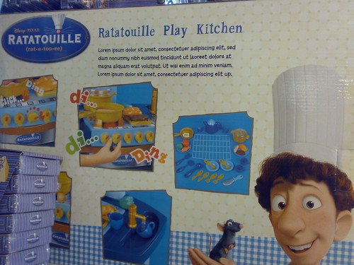
Something tells us Pixar didn't mean to serve Lorem Ipsum on the menu!

This one begs the question: Who actually approved selling the same car three times in the same ad?

The point of the post? Proof-read your designs before they either A. Go to Print or B. End up on a blog!

Awesome Gift Ideas for Graphic Designers

Graphic Design Blog
After browsing the internet over the past few days for design related holiday gifts, we found some awesome design/ graphic design related objects that should be found in any designer's house. Take a look at let us know what you think! Would you give these design-y gifts to a graphic designer loved one?

Pantone Swatch Toothbrush
A Pantone Swatch toothbrush!? While it may seem odd to get a toothbrush for the holidays, this would make an awesome stocking stuffer for the designer in your life.

Friday, November 18, 2011

Lorem Ipsum Wonders v. Blunders

Every once in a while we in the design world catch a screw-up and then plaster the internet with it. This is not only embarrassing to the designer, but the company as well. But what if the screw-up wasn't a screw up at all, but a carefully executed publicity stunt aimed at getting more business for the company? It could be! This is the case of the 'Lorem Ipsum' bag printed hundreds of thousands of times by Chipotle. Us designers cringe when we see this initially, because - by any standards - that's a HUGE screw up. Leaving your 'Greek' on the side of a well known food chain's carry out bags? Career ending stupidity, or clever design quirk?

If one looks close enough at the lettering, you can see that it is in fact, handwritten. Now who would take the time to handwrite a bunch of Lorem Ipsum? Someone who intended for it to be there of course! The next question though, is why? Do an inordinate amount of Graphic Designers and Web Developers eat at Chipotle and would find humor in the use of the common Latin phrasing? Perhaps. Another, perhaps more obvious conclusion would be that Chipotle has actually commissioned their oft-used typeface to be digitized and it was in fact a screw up. Sure it looks handwritten, but it is possible to create typography with special software, especially for a company that uses it everywhere. What do you think? Mistake or Witty Design?

Other Examples of Real Mistakes

These poor guys did actually leave this on here on accident. Edwardian isn't exactly a custom font.

Something tells us Pixar didn't mean to serve Lorem Ipsum on the menu!

This one begs the question: Who actually approved selling the same car three times in the same ad?

The point of the post? Proof-read your designs before they either A. Go to Print or B. End up on a blog!

Tuesday, November 8, 2011

Why use a Graphic Design Firm?

Ever sat in a room and watched a PowerPoint presentation? If you said yes, then you already know why it's important to hire a professional. PowerPoint is the bane of every Chicago Graphic Designer and Marketing Company in Chicago, IL because of it's distinct LACK of good design.

Over time, PowerPoint has had a catastrophic effect on the quality of graphic design. In short, this software made it possible for anyone to create designs and layouts, the result of which was a lowering of the bar.

Would you design an office building without hiring an architect?
Graphic designers use interpretive and conceptual skills to create visual solutions to communications problems. They find the most effective method for conveying information. They use a variety of techniques to achieve results based on their understanding of color, typography, illustration, photography, animation, layout, and media.

Professional designers know how to use the principles of design to communicate a message, present data, or elicit a desired response. It's not impossible for an amatuer to achieve the same results, but it's less likely.

What constitutes good design? The message must be clear. Whether a poster, brochure, logo, or Chicago Website Design — the design should emphasize the message.

The basic principles of graphic design apply to all design disciplines — writing, graphics, art and architecture, even fashion and poetry. The principles of design are tools we use to format the elements of design (color, shape, texture, etc.). Here are some of the essentials:

Balance
Balance is based on the notion, "the whole is the sum of its parts." Using balance, design elements or the "parts" are organized to create a whole that has equilibrium.

Proportion Similar to balance, good proportion maintains an agreeable relation of parts within the whole. It's the consideration of parts in relation to the whole.

Contrast
Contrast, created when elements are combined, provides necessary variety. Without contrast, even good design can be boring (or worse, ineffectual). While balance and proportion help to maintain cohesiveness, contrast adds interest.

Space
Perhaps most important to overall quality of design — as important as emphasis, but overlooked by many designers — is space. Including space (often called white space) in a design provides its other elements with all the characteristics listed above. More often than not, a graphic design fails without space.

While the principles listed above are vital, they are not comprehensive. Thousands of books have been published on the subject of graphic design; depending on your interests and needs, seek out one or more of these for study.


Marketing Company in Chicago, IL
Graphic Design Company near Chicago IL
Web Design Company near Chicago IL
Advertising Agency in Chicago