If you are into blogging, cool social media posts, or just like the idea of creating images & graphics for things (maybe invitations, posters, album covers, etc.) but you are not that great with Adobe Photoshop, InDesign, or Illustrator, then we have a savior for you.
Canva.
If you are unfamiliar with Canva, for whatever reason, we we will give you a quick and easy tutorial of how to use it.
1. Sign up form account.
 2. Choose a design template that you'd like to use
. Canva conveniently labels them so you know what size works best for your project. There are more options than in this picture but we can only take screen shots that are so big, you know?
 3. Choose your project.
 For this example, we will choose the "social media" template. There are templates for specific social media platforms, emails, marketing materials such as business cards, posters, flyers, menus, etc. You can also choose templates for documents and presentations, blogging & ebooks, events, advertising tools for both print and web. Yeah, you have a lot of options.
 4. Get to creating
. From here, you can choose your various options.
a. Layouts that are pre-designed. Some of the layouts are free to use and some cost $1. If you choose a layout, you can manipulate it how you want. You can change font, images, colors, etc.
 b. Text
. There are several text layouts that you can choose from, again, some are free and some cost $1. If you don't see that you like, you can add in your text that is structure-free. As a
Chicago graphic design studio, even we approve of the text options they offer (although, they do offer Lobster and a few other iffy fonts…).
 c. Backgrounds
. Want a cool background? They have plenty of options, free and $1. Again, you can change the color of the background. Top left corner, you can see the color options (the + is so you can create your own color).

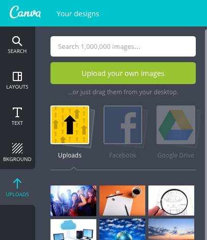
d. Uploads. You can upload your own photos to use in your creations, too! You can connect to Facebook and Google Drive to attach photos as well.
Are you excited to use Canva? We sure hope so! If you have any questions, don't hesitate to
contact Integraphix, a
Chicago graphic design agency with over 25 years experience.
 A classic, nay, iconic sign of true friendship is the fist bump. Coca-Cola has decided to embrace that sign of affection and connection in its new campaign in Latin America.
 The goal of the campaign is to engage teens in a conversation about being true friends, especially in difficult moments. In the teenage years, it is a vulnerable time of social pressure, especially in 2015 with cyberbullying. Coca-Cola has made short web films showing teens stepping up for their friends in difficult times.


